Flexbox allows you to control the flow of the elements on the page to make more complex layouts—like columns—and helps simply align things in two dimensions.
It’s all about the children
Flexbox is one of many different ways to control the flow & layout of elements in your web design. It’s specifically good at distributing & aligning elements in a single dimension: generally for making elements fit beside each other on the same line. But can also work vertically.
Flexbox is different from many other CSS properties: instead of targeting an element and acting directly upon it, we target the parent element and that controls the layout of its children.
We’re making a flex container and all the children of that container become flex items.
<section> <!-- ← Flexbox CSS goes here! -->
  <div></div>
  <div></div>
</section>
To make the two <div> tags above sit beside each other on the same line, we have to add only 1 line of CSS:
section {
  display: flex;
}
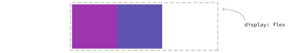
It’s extremely important that we add the CSS to the parent element, which then controls the layout of all the direct children within it.
Targets the direct children
We have to be very careful to group our elements, because flexbox works on children, so we can run into some weird situations.
<section>
  <h2>Unicorns</h2>
  <p>Majestic, magical myths.</p>
  <h2>Narwhals</h2>
  <p>Noteworthy, nice normal.</p>
</section>
With HTML like the above, if we added display: flex to the parent (<section>) we’d essentially be trying to get all 4 of those elements on the same line. Because flexbox acts on the direct children—it’s trying to layout the <h2> & <p> tags directly.
But, most likely, what we’re trying to achieve is two columns, so we need to be careful to group the elements together:
<section>
  <div>
    <h2>Unicorns</h2>
    <p>Majestic, magical myths.</p>
  </div>
  <div>
    <h2>Narwhals</h2>
    <p>Noteworthy, nice normal.</p>
  </div>
</section>
With the proper grouping, the <div> tags are now affected by display: flex and the <h2> & <p> tags are not turned into flex items.
Boxes: block & inline
When you set an element to display: flex you’re setting two things specifically: how the box itself will act (outer display) & how its children will act (inner display).
By default all flex containers act like block-level elements. And their children act like flex-items, trying to fit on the same line.
This is what you are essentially defining:
section {
  display: block flex;
}
block— How the outside of the box will act, like settingdisplay: blockflex— How the inside of the box will act, as flex items
I bet you didn’t realize you can define display for both the “outside” the box and the “inside” of the box!
But sometimes, we do want our flexboxes to behave more like inline-block containers, so there’s alternative mode that looks like this:
section {
  display: inline-flex;
}
Which will make the parent element behave like an inline-block element while still allowing the children to be flex items.
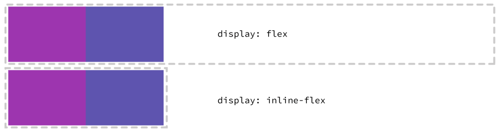
You could actually write that as display: inline flex but the browser support isn’t so great right now.
Links
Say goodbye to margin collapse
We talked about margin collapse previously: how two margins that touch each other vertically will collapse to the size of the biggest one.
Well, of course, flexbox acts differently. Instead of the margins collapsing into the largest of the two: all margins are honoured.
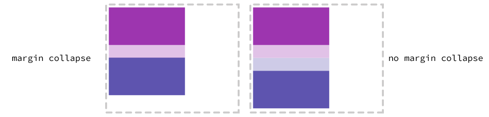
Two margins that butt against each other will not collapse but push each other away.
Justification & alignment
Flexbox gives us lots of control over how the elements within the flex container are aligned & distributed. There are a few different properties that we can apply to get elements to arrange the way we want.
Flex item widths
First, we can use the standard width on our flex items to control how much space they take up.

section div {
  width: 50%;
}
There’s an alternative property, flex-basis, that works very similarly to width in many situations but has some other interesting side effects.
Justifying content
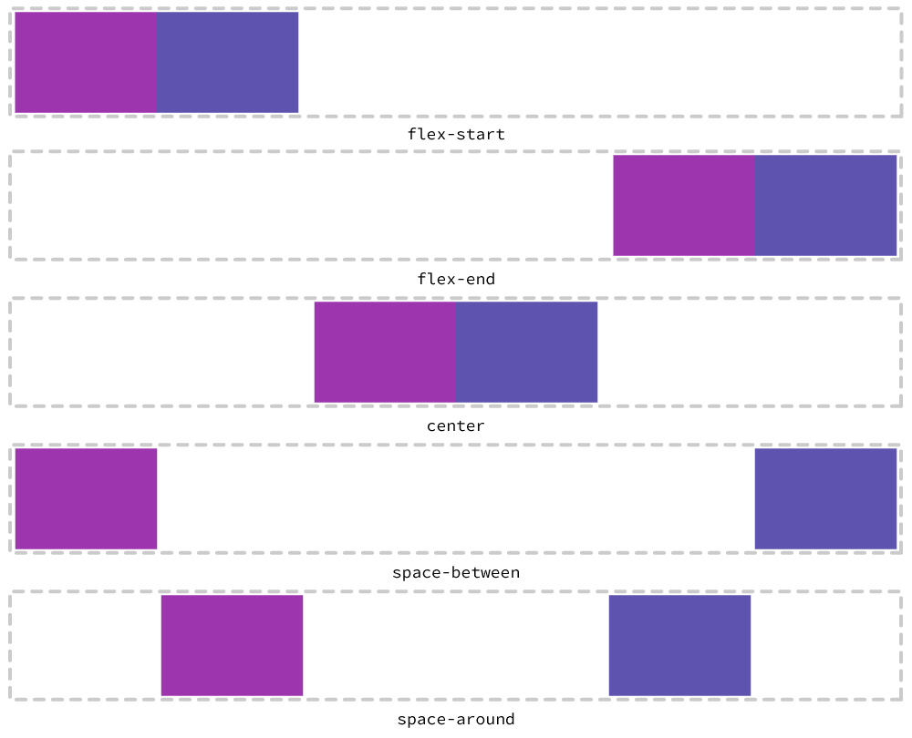
We can distribute the elements along the axis that the flex items are arranged using the justify-content property.
There are a few different ways to use justify-content:
flex-start— the default positionflex-end— the opposite location offlex-startcenter— move all the items into the center of the arrangementspace-between— makes the elements touch the start & end edges of the flex container then evenly distributes the space between the elements.space-around— adds equal space on both sides of the elements to space them out, unfortunately this doubles the spaces in the center of the elements from what’s on the edges.
Using our HTML above, we could do:
section {
  justify-content: space-between;
}
Aligning content
Where the justification properties work in the main arrangement, the alignment properties work in the opposite orientation to the main arrangement.
That’s a complicated way to saying that we can arrange elements against each other—it’s specifically helpful if the flex items are different sizes.
There are a few different ways to use align-items:
flex-start— the default positionflex-end— the opposite location offlex-startcenter— align the items against their centres, adjusting for their different dimensionsstretch— force the elements to be the same size
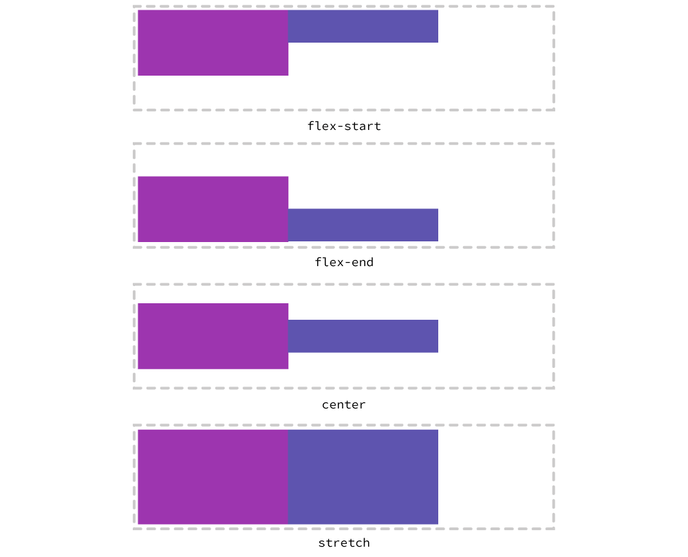
Using the HTML above, we could do:
section {
  align-items: center;
}
Ordering content
We can even rearrange the elements inside the flex container using the order property. We can then have the HTML in a logical order in the code, but display it visually in a different order.
The order property accepts an integer: the numbered position you want the item to be located at. We can also use negative numbers, for instance, -1 will move something to the start.
section div:last-child {
  order: -1;
}

Vertically flexible & wrapping
So far we’ve concentrated on positioning flex items horizontally, but flexbox also works vertically. Vertical flex containers are helpful for distributing content equally.
It’s now important to learn about flexbox’s axes and how that affects justify-content and align-items.
justify-contentalways works on the “main” axis, forflex-direction: row, that’s horizontal, but if we switch to acolumnorientation, now the flex direction switches.align-itemsis the opposite, working on the “cross” axis, forrowthat means vertically, but forcolumnit switches to be horizontal.
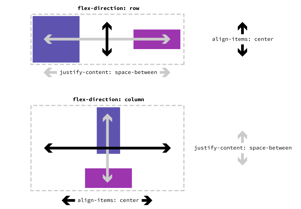
Remember that justify-content works in the direction you are arranging the elements. And align-items is opposite that.
So, if we want to align items in a vertical orientation we can add flex-direction: column:
section {
  flex-direction: column;
}
Reverse directions
There’s also the reverse direction, which works similar to order, but allows you to completely reorder the elements opposite to what their written in the code:
section {
  flex-direction: row-reverse; /* or column-reverse */
}
Wrapping flex items
When there isn’t enough space in the container we can also get flex items to wrap to the next line, similar to the browser’s standard flow works. Wrapping flex items isn’t terribly reliable but sometimes works the way you need it to.
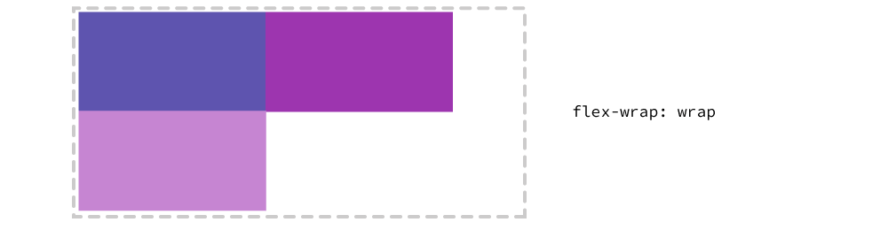
section {
  flex-wrap: wrap;
}
That brings us to another alignment property: align-content. align-content only works when the elements are wrapped within their flexbox container and allows you to align the whole grouping of those wrapped elements.
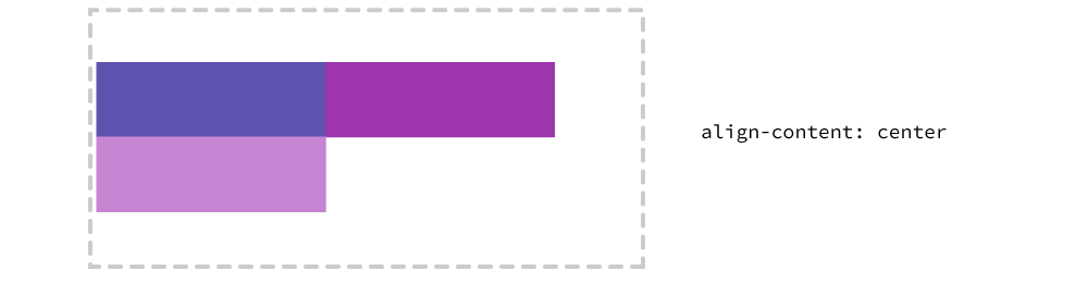
section {
  align-content: center;
}
If you can stick to flexbox working in only a single dimension, AKA not wrapping, you’ll probably have a better time creating the layouts but wrapping can work to your advantage sometimes—especially responsive websites.
Flexbox navigation
Making a navigation bar using flexbox has completely identical HTML to any other kind of navigation—except flexbox will give us much more control of the alignment & distribution of the navigation items on our page.
So, let’s start with that basic HTML:
<header>
<nav>
<ul>
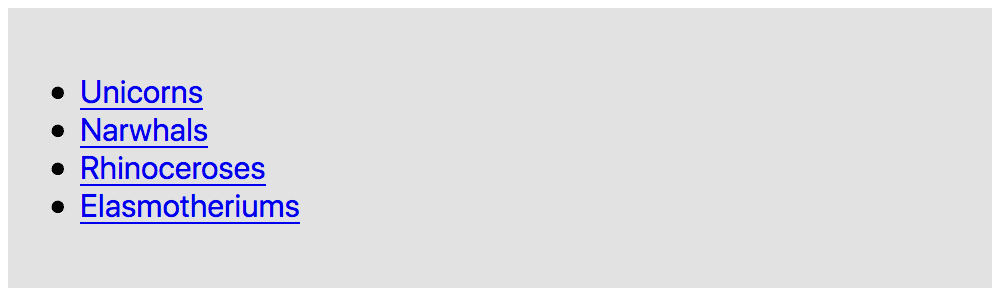
<li><a href="#">Unicorns</a></li>
<li><a href="#">Narwhals</a></li>
<li><a href="#">Rhinoceroses</a></li>
<li><a href="#">Elasmotheriums</a></li>
</ul>
</nav>
</header>
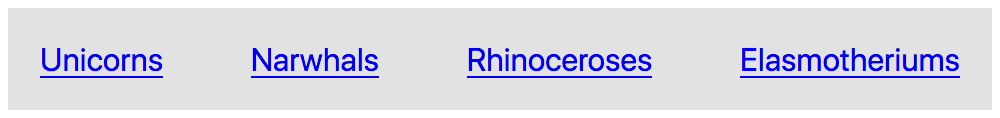
Our goal is to get each of the navigation items side-by-side in one row. To start we target their direct parent element & apply display: flex:
nav ul {
  list-style-type: none; /* Don’t forget to remove the bullets */
  padding: 0; /* And that extra space on lists! */
  margin: 0;

  /* This is the magic, but must be put on parent elements! */
  display: flex;
}

This gets us pretty close, but I would like a little spacing and distribution on the links, so we’ll add justify-content:
nav ul {
  list-style-type: none;
  padding: 0;
  margin: 0;
  display: flex;
  justify-content: space-between;
}
Although, I think that’s maybe too spaced out, so let’s get them in the centre:
nav ul {
  list-style-type: none;
  padding: 0;
  margin: 0;
  display: flex;
  justify-content: center;
}

With a little bit of margin around them everything looks great:
nav li {
  margin: 0 .4em;
}

That’s all—two (ish) lines of CSS!
Flexbox columns
We can use flexbox to get HTML elements beside each other on the same row to make grids & columns. So, let’s quickly look at how to make two pieces of content side-by-side.
We’ll start with the basic HTML setup:
<section class="columns">
<div>
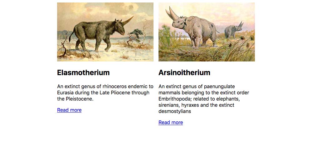
<img src="images/elasmotherium.jpg" alt="">
<h2>Elasmotherium</h2>
<p>An extinct genus of rhinoceros endemic to Eurasia during the Late Pliocene through the Pleistocene.</p>
<a href="#">Read more</a>
</div>
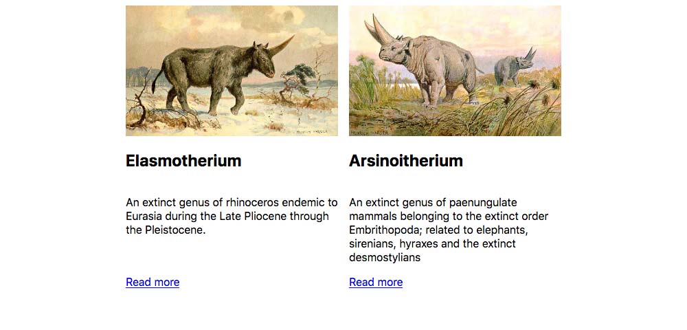
<div>
<img src="images/arsinoitherium.jpg" alt="">
<h2>Arsinoitherium</h2>
<p>An extinct genus of paenungulate mammals belonging to the extinct order Embrithopoda; related to elephants, sirenians, hyraxes and the extinct desmostylians</p>
<a href="#">Read more</a>
</div>
</section>
Next up we’ll target the <section> and turn it into a flex container.
.columns {
  display: flex;
}
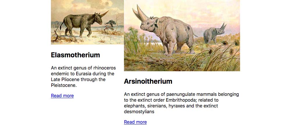
The two <div> tags, because they are direct children of the .columns are now side-by-side flex items. But things are a little funky—nothing a little width won’t fix:
.columns div {
  width: 50%;
}
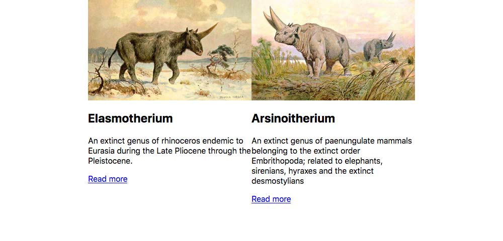
That works to get the columns touching & close together, but if we want a little surrounding space we could use padding:
.columns div {
  width: 50%;
  padding: .5em;
}
Distributing content evenly
One thing you’ll see—with your designer eye—in the layout above is that the “Read more” buttons don’t align with each other—we can overcome that with another flexbox container.
.columns div {
  width: 50%;
  padding: .5em;
  display: flex;
  flex-direction: column;
}
This new flex container is in the column direction, which adjusts the location of the items vertically.
And the last little bit is to choose what element will expand to fill the space—flex-grow will help with that:
.columns p {
  flex-grow: 1;
}
Do notice how we got extra space between the <p> & <h2> tags. That’s because margins do not collapse within a flex container—so we are seeing the margins from both the <p> & <h2> tags.
Video list
- Flexbox: Introduction
- Flexbox: Wrapping rows
- Flexbox: Direction
- Flexbox: Horizontal navigation
- Flexbox: Columns
Supplemental links
- A Complete Guide to Flexbox
- Flexy Boxes
- Flexbox Cheatsheet
- Flexbox Cheatsheet
- How Flexbox works — explained with big, colorful, animated gifs
- Even more about how Flexbox works — explained in big, colorful, animated gifs
- The Ultimate Flexbox Cheat Sheet
- Learn Flexbox for Free
- Flexbox Cheatsheet
- Flexbox Cheatsheet
- Understanding Flexbox: Everything you need to know
- The Ultimate Guide to Flexbox — Learning Through Examples
- Flexbox: How Big Is That Flexible Box?
- Flexbox use cases
- Flexbox guides on MDN
- Laying Out A Flexible Future For Web Design With Flexbox Best Practices
- Almost complete guide to flexbox (without flexbox)