Flexbox cheat sheet
Enabling
-
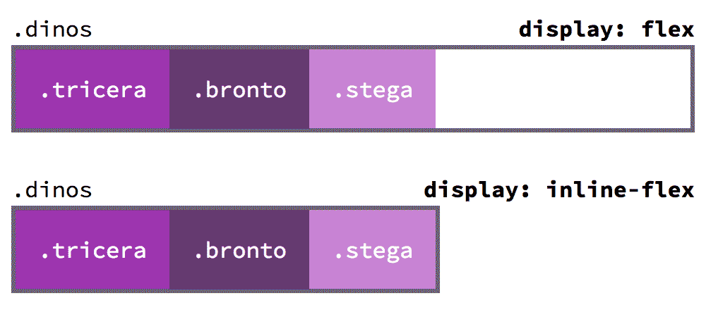
display: flexTurns a parent element into a flex container-all child elements will become part of the flex flow.
Forces the parent element into a
display: block-like state where it takes up an entire row..dinos { display: flex; }Affects all the child elements inside this parent container element.
-
display: inline-flexSame as
flexbut allows the parent element to bedisplay: inline-block.dinos { display: inline-flex; }Affects all the child elements inside this parent container element.
-
Affects child elements
The flexbox code is triggered on the parent element, but affects all of the child elements.
Orientation
-
flex-directionrow,row-reverse,column,column-reverseChoose the direction of the flexbox children, horizontally (
row) or vertically (column).The
*-reverseoptions will reorder the children in the opposite order they’re written in HTML.rowis the default..dinos { flex-direction: row; }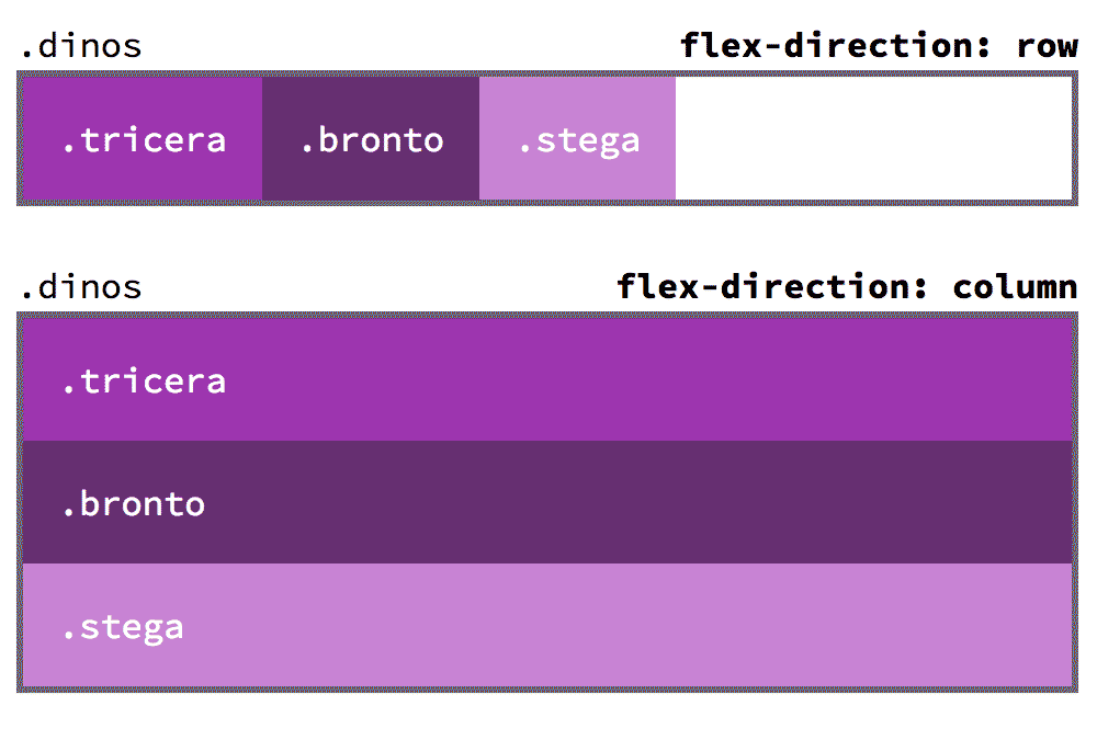
-
flex-wrapwrap,nowrapWhether to allow the child elements to wrap to another line or force them all on a single line.
nowrapis the default..dinos { flex-wrap: nowrap; }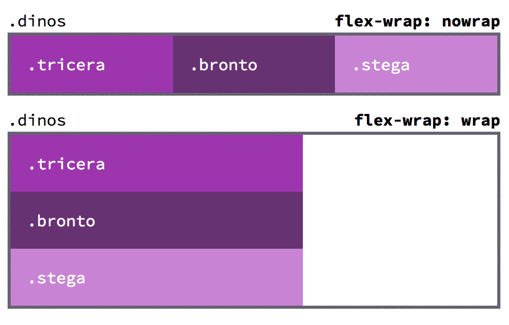
-
orderReorder a single child element within the flex flow. Negative numbers allowed.
.stega {
  /* Move an element to the start */
  order: -1;
}
.bronto {
  /* Move an element to the end */
  order: 1000;
}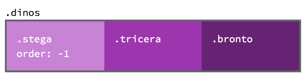
Alignment
-
justify-contentflex-start,flex-end,center,space-around,space-betweenControl how the elements are spaced within their parent flex container.
.dinos {
  /* Move all elements to the center */
  justify-content: center;
}
.dinos {
  /* Make elements touch the edge and space evenly between */
  justify-content: space-between;
}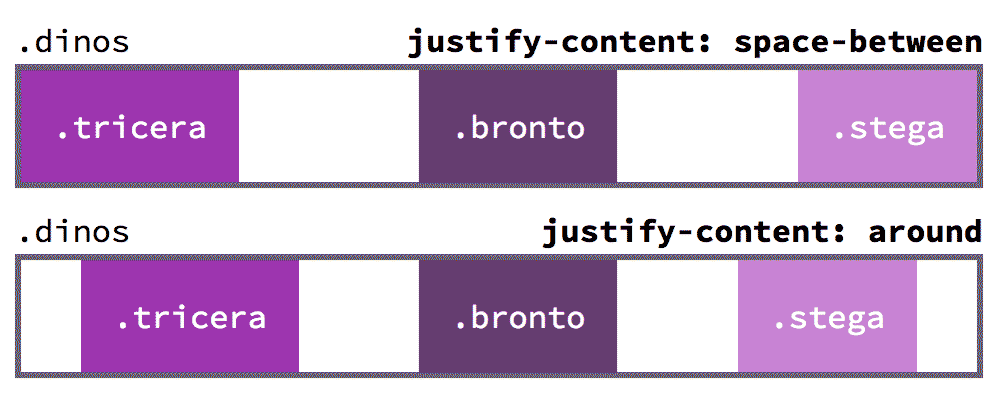
-
align-itemsflex-start,flex-end,center,stretchControl how elements are aligned in the opposite direction of their justification.
.dinos { /* Force all elements to be the same height */ flex-direction: row; align-items: stretch; }align-self— is a similar property, but allows you to target a single child element, instead of all of the children..stega { /* Force .stega to be at the bottom */ flex-direction: row; align-self: flex-end; }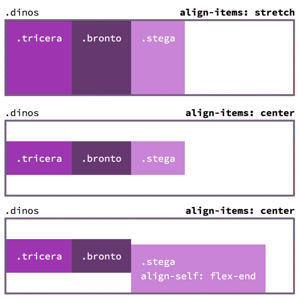
-
align-contentflex-start,flex-end,center,space-around,space-between,stretchHow to align the grouping of wrapped flex children—only works with
flex-wrap: wrap.dinos { /* Spread the wrapped children to fill their parent */ align-content: space-between; }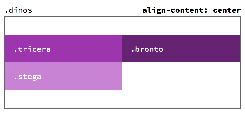
Flexibility
-
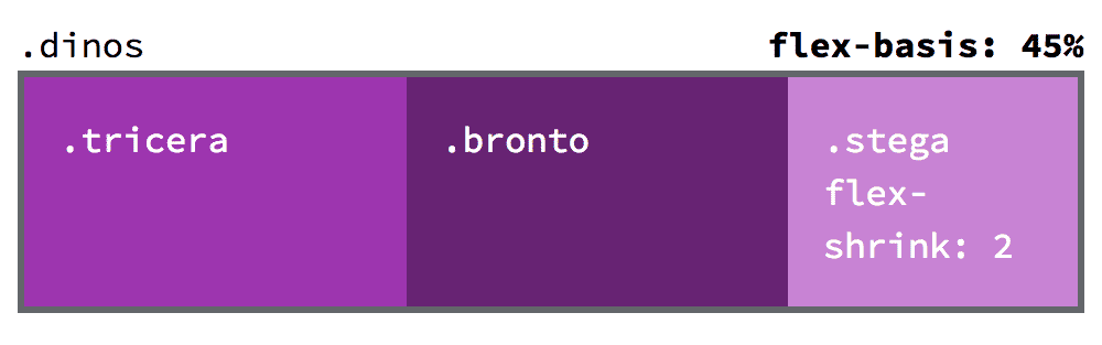
flex-basisSimilar to
widthandheightbut not a guaranteed size: it can adjust up or down within the flex-parent to make sure the elements fit. It’s more like a suggestion..stega { /* Same size as the content */ flex-basis: content; } .bronto { /* 45% the width of the parent */ flex-basis: 45%; }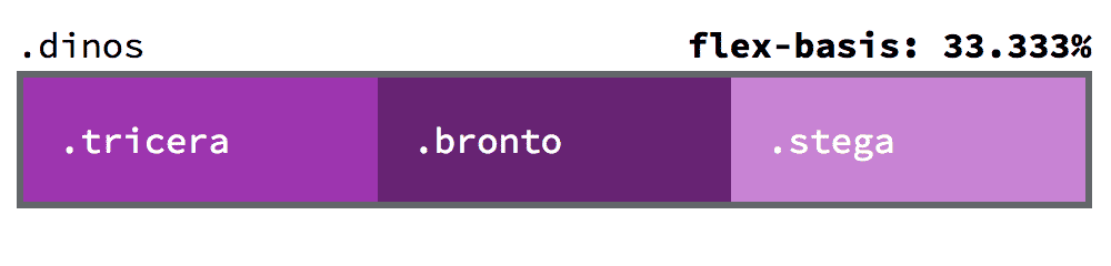
-
flex-growA unitless number that defines how much of the leftover space this element should be allotted.
Chunks the leftover space and allots based on this multiplier.
Without
flex-growall elements will be allotted the same amount of space..bronto, .tricera { /* Gets 1 piece of the space */ flex-grow: 1; } .stega { /* Gets 2 pieces of the space */ flex-grow: 2; }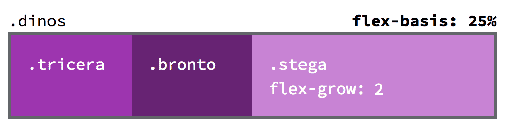
-
flex-shrinkOpposite to
flex-grow: defines how much space it can shrink.If there isn’t enough space available the element will remove allotments against this multiplier.
.stega {
  flex-shrink: 2;
}