Every single thing you target with CSS, every single HTML element, is a box. The boxes line up beside each other, above each other, and below each other.
Even though everything is a box and should be thought of as a box, that doesn’t mean it needs to look like a box—we can change the style of each box.
The box model
The box model is the name of part of the layout system browsers use when rendering your website. It’s a system that describes how each of the properties of a box interact with each other and how they interact with other boxes.
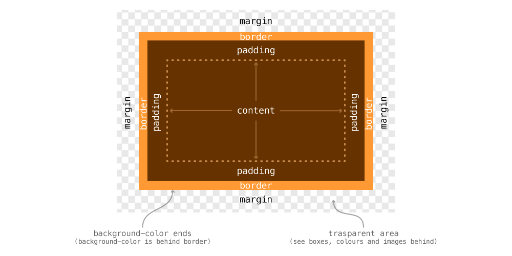
- A box with no content isn’t visible, so content is the first layer
- Outside content is the
padding, pushing the edge of the box away from the content - Outside the padding is the
border, the background colour stops here - Outside the box is the
margin, a transparent layer pushing other boxes away
Margin & padding
The margin and padding properties are used to put space around your box, either outside the box or inside the box.
margin— adds spacing outside of the box, pushing other boxes awaypadding— adds spacing inside the box, pushing the content away from the border; the background colour is visible within the padding
div {
  /* Will push other boxes 10 pixels away on all 4 sides */
  margin: 10px;
  /* Will push the content away from the box edge on all 4 sides */
  padding: 12px;
}
Since boxes have four sides, there are four different margins and paddings that can be changed.
- For margin, we have
margin-top,margin-right,margin-bottom,margin-left. - For padding, we have
padding-top,padding-right,padding-bottom,padding-left.
Margin & padding shorthand
We can specify margin and padding using the properties listed above, but often it’s easier to use the shorthand version.
Everything below applies equally to the padding shorthand.
div {
/* margin: top right bottom left; */
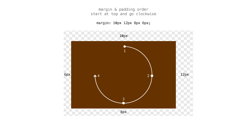
margin: 10px 12px 8px 6px;
}
Inside the shorthand margin declaration we can specify up to 4 values, each representing a side of the box.
For the order, we start at the top of the box and make our way clockwise around the box.
We can then start leaving off numbers from the end of the value list and the browser will match the opposing side’s value for any missing numbers.
div {
  /*
    Since the left margin is missing, the browser will use the right value
    margin: top right/left bottom;
  */
  margin: 10px 12px 8px;

  /*
    Since the bottom margin is missing, the browser will use the top value
    margin: top/bottom right/left;
  */
  margin: 10px 12px;
}
Margin collapsing
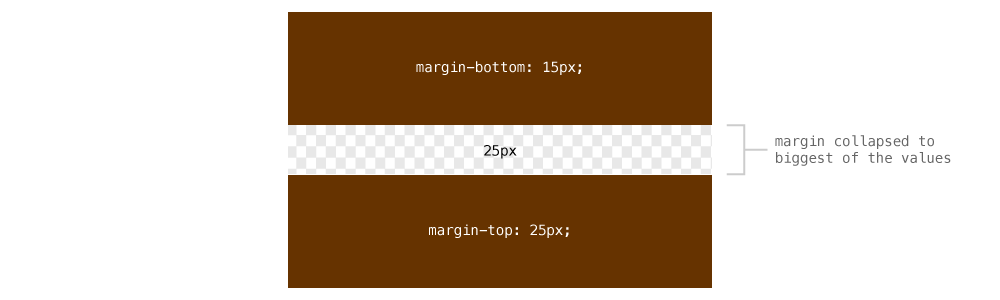
Margins have some weird behavior when it comes to their top and bottom values. The bottom value of one box can collapse into the top value of the next—the browser choosing only the highest of the two.
.box-1 {
  margin-bottom: 15px;
}

.box-2 {
  margin-top: 25px;
}
The distance between these boxes will not be 40px—but instead the browser will pick the bigger of the two and choose it. So the margin between these boxes is 25px.
Width & height
Both width and height can be assigned to boxes. Usually we want widths set in some sort of relative measurement, like % or em.
Try to avoid using height—use other methods, like padding, instead. It’s especially important to be careful with height when working with text. If you user changes the font size in their browser, the whole layout could bust apart if there is a fixed height.
div {
  /* Will be 30% the width of the parent element */
  width: 30%;
  /* Width based on the font-size */
  width: 35em;
}
What units to use
You’ll grow an intuition as to when to use each unit, but here are a couple of ideas:
%— use percents for elements that should grow with the size of the browser, e.g columns, imagesem— use ems for elements that should grow with the size of the text, e.g. line-lengthspx— use pixels for things that should never change size, e.g. logos, icons
Minimum & maximum values
For both width and height we can provide minimum and maximum values instead of fixed values.
min-width— force the box to be at least this wide, but can grow widermin-height— force the box to be at least this tall, but can grow tallermax-width— force the box to never exceed this width, but can get narrower than itmax-height— force the box to never exceed this height, but can get shorter than it
article {
  /*
    Force the box to be at least 10em high
    If the text needs more space, the box can still grow
    Much better than using `height`
  */
  min-height: 10em;
}
p {
  /*
    Force the paragraph to never exceed a width of 35em
    It’s a good way to control line-length
  */
  max-width: 35em;
}
When to use height
There aren’t too many reasons to use height, min-height I use often, but I can usually create a whole website without ever touching the height property.
One example that is a good use of height is to make a box the same height as the browser window, for large banners and hero graphics.
header {
  /* Would make the head the same height as the browser window */
  height: 100vh;
}
Adjusting layout math with border box
The default box model layout system in websites doesn’t work very well with responsive and flexible websites. It’s best to change to a newer layout system so everything works more smoothly.
The newer layout system is called “Border Box” and changes the math used when calculating widths and heights of boxes.
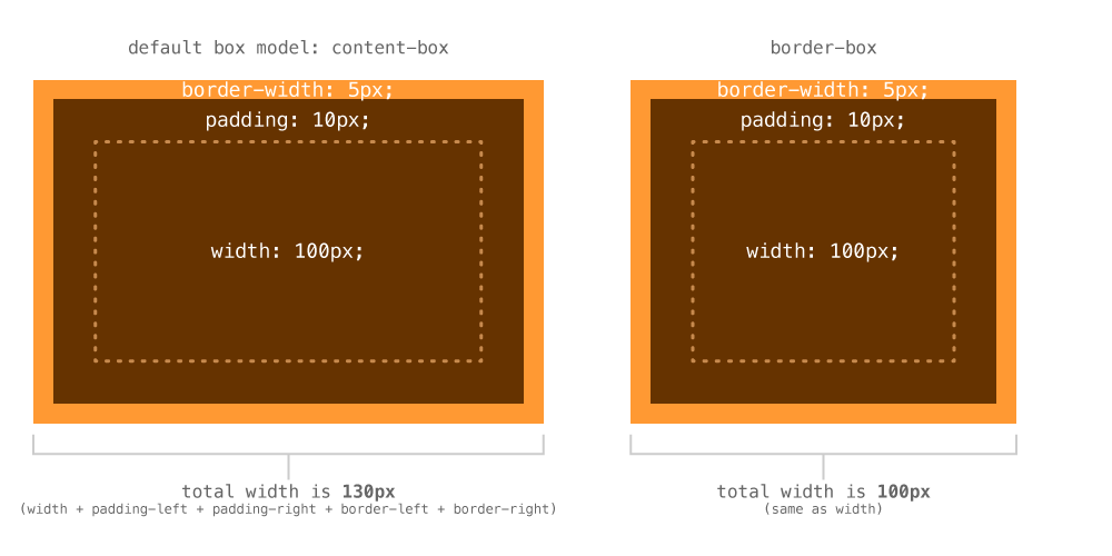
- With the default box model, the
paddingandborderadd onto thewidthof the box, making it wider - With border box, the
paddingandborderare inside thewidthof the box, so the total width is the same as the value ofwidth
For responsive and flexible designs this is extremely helpful. If you want a column to be 30% wide, you don’t have to subtract with width of the padding to make it exactly that wide.
So, to change your box model, add these lines of code to the very top of your website:
html {
  box-sizing: border-box;
}

*, *::before, *::after {
  box-sizing: inherit;
}
I add this code to the top of every single website I create.
Box decorations
There are lots of different decorations you can apply to a box.
Background colour
The most basic decoration is background-color, which just applies a colour to the background, behind the padding.
header {
  background-color: #000; /* Solid black */
  background-color: rgba(0,0,0,0.5); /* Semi-transparent black */
}
Border
Border puts a line around the box, outside the background colour. The line can be solid, dashed, dotted, or an image.
The most basic border has 3 values: width, style, color:
header {
  /* Apply the same border to all 4 sides of the box */
  border: 3px solid #000;
}
width— a measurement to describe the thickness of the borderstyle— what kind of border:solid,dashed,dotted,double, etc.color— any colour for the border, including semi-transparent ones
If you want to style a specific side of a border, you can target it directly with border-top, border-bottom, border-left, border-right.
nav {
  border-bottom: 4px solid pink;
}
Each of the inner values also have their own properties like: border-style, border-color, border-bottom-color, etc.
header {
  /* Applies border to all 4 sides */
  border: 3px solid #000;
  /* Overwrites bottom color */
  border-bottom-color: pink;
  /* Overwrites right width */
  border-right-width: 1px;
}
Links
Border radius
The border-radius property allows you to add rounded corners to your boxes.
a {
  /* Add 8px rounding to all 4 corners */
  border-radius: 8px;
}
You could also specify the border-radius in other units:
em— the border radius would change with the font size%— of the box itself: using 50% would make a circle/oval
If you want to specify only certain corners, add more values, like margin and padding:
a {
  /* Top left, bottom right & top right, bottom left */
  border-radius: 8px 10px;
  /* Top left & top right, bottom left & bottom right */
  border-radius: 8px 10px 6px;
  /* Top left & top right & bottom right & bottom left*/
  border-radius: 8px 10px 6px 12px;
}
Links
Box shadow
Box shadow allows you to add a drop shadow to the box itself, where text-shadow adds to the text inside the box.
div {
  box-shadow: 2px 4px 5px rgba(0,0,0,0.5);
}
When specifying box-shadow there’s four values to write out:
horizontal offset— how far to shift the shadow left and right: positive numbers move right, negative move leftvertical offset— how far to shift the shadow up and down: positive numbers move down, negative move upblur radius— how blurry the edge of the shadow will be, the bigger the number the lighter the shadow;0would make a crisp edgespread— (optional); how much bigger the shadow is than the boxcolor— any colour you want, including semi-transparency
div {
  /* Specifying `inset` inside the declaration will make the shadow inside the box */
  box-shadow: inset 0 0 5px rgba(0,0,0,0.5);
}
You can also specify multiple shadows on the box using a comma:
div {
  box-shadow: 2px 4px 5px black, -2px -4px 5px red;
}
Links
☛ Decorations with images are covered in the “Using images” tutorial
Video list
- Box model: margin & padding
- Box model: collapsing top & bottom margins
- Box model: width and height
- Box model: adjusting layout math with border box
- Box model: box decorations