Part of making amazing & useful websites is planning and organzing the content in a way that’s logical & user friendly. There are lots of tools to help us understand & organize our content for the web.
Content first
Since text & content is so important to websites we want to think about it and consider it really early in the process.
Don’t write a single line of code until you know the purpose of your website. Don’t write code until you know what is going on the pages: home important it is, and in what order.
Content inventory
One way to help understand our content is to create a content inventory. It helps you see what content you have, what content you need & helps you understand the information of the website you’re building.
A simple content inventory might look something like this:
| Title | Type | URL | Person | Status | Location | Keywords |
|---|---|---|---|---|---|---|
| Brachiosaurus | article | /dinos/herbivores/brachiosaurus | Anning | approved | CMS | dinosaur, herbivore, long neck, sauropod |
| Ovariptor | blog post | /dinos/omnivores/oviraptor | Brown | draft | CMS | dinosaur, omnivore, raptor, small |
The headings help us understand the content & its purpose on our website:
- Title — What’s the name of the content? What is the content subject?
- Type — The kind of content it is: article, image, blog post, social post, etc.
- URL — The content’s URL on the website
- Person — The person responsible for maintaing the content
- Status — Is the content ready to be used? Does it need work?
- Location — Where can the content be found in your organization? CMS, network drive, server, etc.
- Keywords — Keywords the content contributes to your website
The content inventory should be a living document—at least at the beginning—always changing and being updated as you understand the content better.
Card sorting
Card sorting is a technique to help you organize & categorize things. You can using for lots of stuff—but it’s very effective at helping understand content organization.
Usually it’s done with sticky notes on a whiteboard or wall. The sticky notes have content descriptions and during a meeting, all the people move them between categories, suggest title improvements, category names, etc.
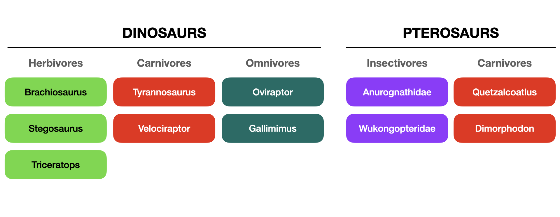
The card sort helps us determine the organization system of our website’s content. What the naming? How is content grouped? How are they linked & categorized?
Card sorting is a really good first step towards making a Sitemap
Links
Content prioritization
Content prioritization helps us understand what our users need from each page of a website—and what they want to find on our websites.
There are lots of different styles of content prioritization—my personal favorite, because it’s so visual, is shades of grey.
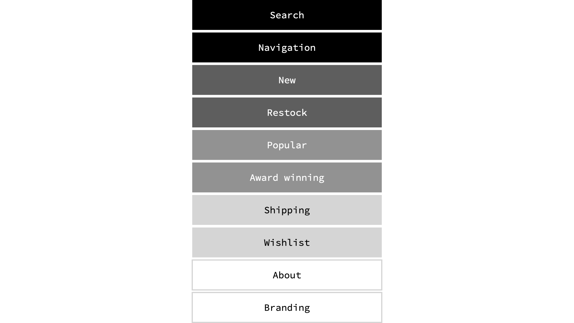
- Black — is the heaviest colour, therefore most important
- Shades of grey — darker is more important, lighter is less important
- White — is very light looking, therefore lease important
The other really popular method is just numbering. Something like:
- 1 — Search
- 1 — Navigation
- 2 — New
- 2 — Restock
- 3 — Popular
- 3 — Award winning
- 4 — Shipping
- 4 — Wishlist
- 5 — About
- 5 — Branding
Content prioritization is a valuable tool when we do the visual design for our website. It helps us understand how the size of the content. Whether the content shoudld be highlighted. If the content should be near the top. More important content should be more obvious on our webpages.
Links
Sitemap
Sitemaps are flow-chart–like diagrams that help us see the connections between pages on our website. They help us organize the navigation & organize how the information will be found.
A simple sitemap might look something like this:
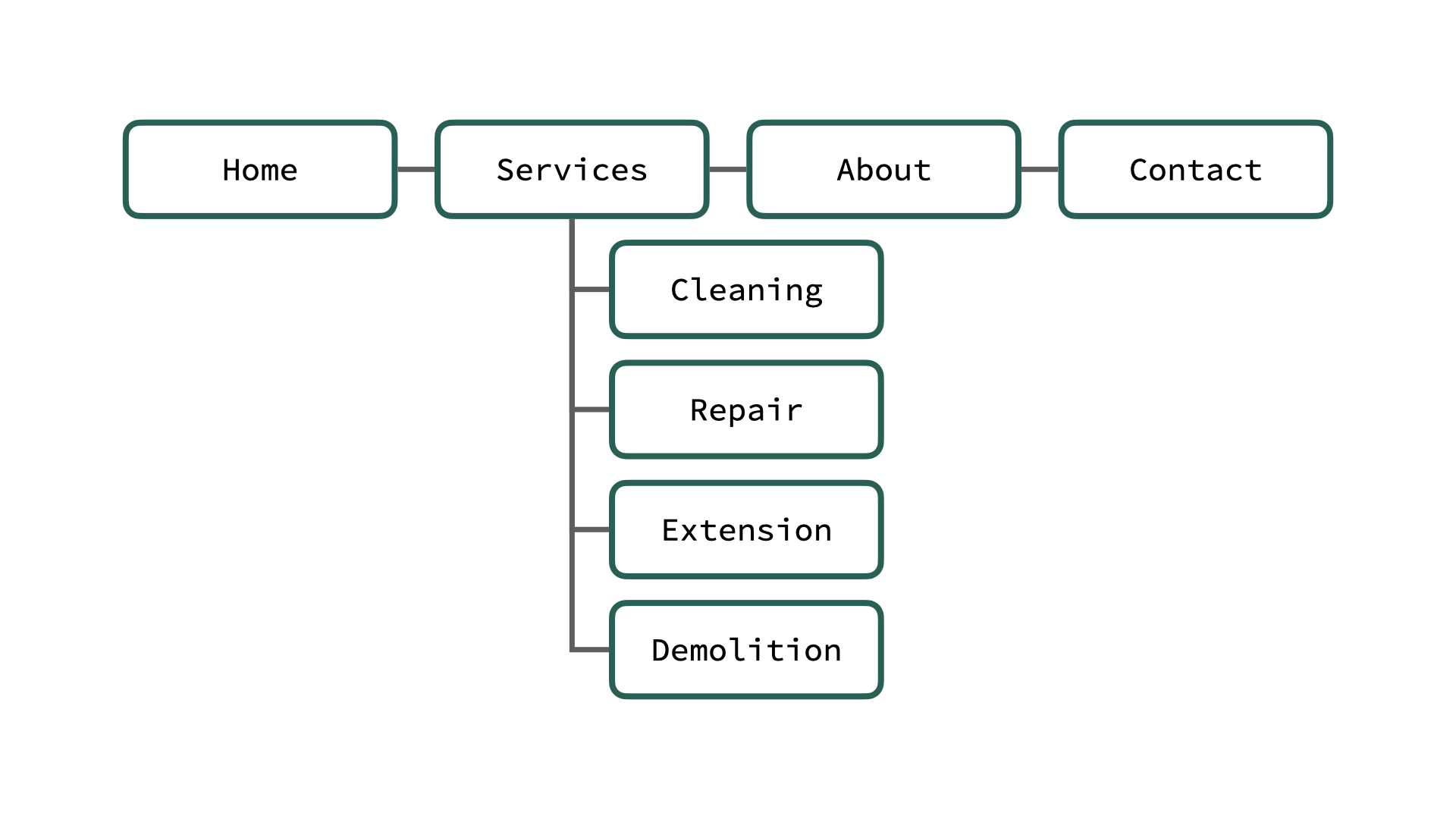
Showing just a top level struture with a few sub-pages.
More complex sitemaps show multiple levels of structure, interlinking & repeated content types. After doing a Card sort, we can more clearly categorize & structure the navigation of our website.
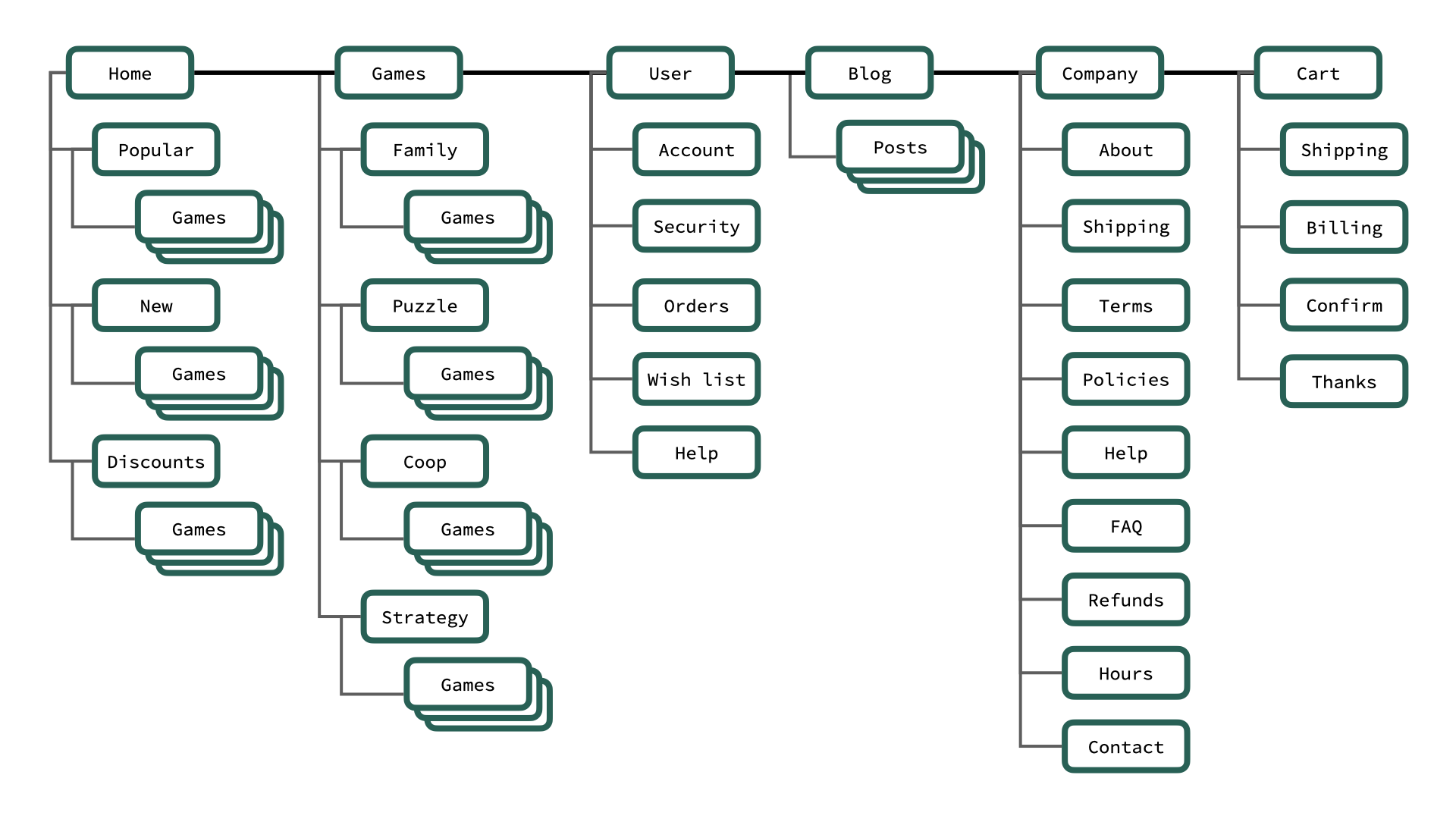
We use sitemaps as a planning exercise for our website: to help use see the navigation, see the interlinking, see the file & folder structure of our website.
Links
Wireframe
A wireframe is a simple illustration that shows the basic layout of your website. Usually just boxes & text.
It’s also really helpful to combine wireframes with content prioritization to help understand what parts of the website are more important than others.
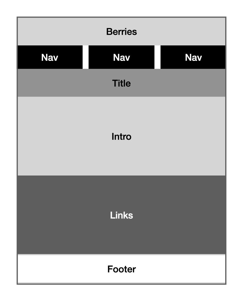
This wireframe describes the layout for the homepage of a website. Using our content prioritzation method you can tell which parts are more important based on the darkness of their box colour.
I like to use real text, as much as possible in the wireframe—but it remains grey boxes.
Ususally you do wireframes for each of the different screen sizes you’re designing for: small, medium & large.
