One of the major goals of the pattern library is to explain why the patterns exist and when to use the patterns. That equally applies to the type choices.
So next up, we’ll describe why we chose the fonts we did and when they should be used.
Remember you’re describing your eCommerce website—don’t just copy this information below.
⋮
font_url: "https://fonts.googleapis.com/css?family=PT+Sans+Narrow:400,700"
rationales:
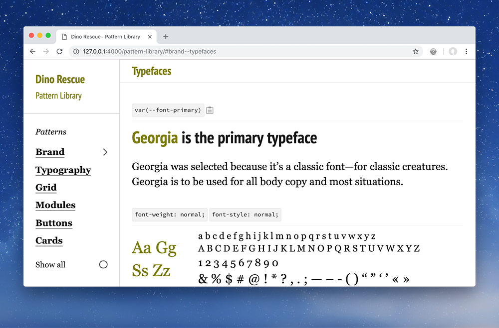
typefaces.primary: |
Georgia was selected because it’s a classic font—for classic creatures. Georgia is to be used for all body copy and most situations.
typefaces.secondary: |
PT Sans Narrow is only to be used for highlighting text: headings, buttons, banners, etc.
Then look in your browser at your typeface descriptions.