We’re going to explore how to use transitions to make fancy hover boxes where images go from greyscale to coloured and zoom in when hovered.
This is what it should look like when it’s done:
An exercise using transitions to create hover boxes that fade from black & white to colour.
We’re going to explore how to use transitions to make fancy hover boxes where images go from greyscale to coloured and zoom in when hovered.
This is what it should look like when it’s done:
Remember the purpose of this lesson is to type the code out yourself—build up that muscle memory in your fingers!
Start the lesson by forking and cloning the fancy-hover-boxes repository.
Fork & clone the “fancy-hover-boxes” repo.
The repository will have some starter files to get you on your way and include requirements for Markbot so you can be sure you’ve completed the lesson.
This includes some starter code that you can get by forking and cloning the repository. You’ll use Markbot to double check everything is done properly.
After forking & cloning the repository to your computer you should have the following files:
There’s also some HTML & CSS already coded so we can concentrate completely on making the hover boxes work.
The HTML boilerplate already exists for us, we just need to write the hover box HTML. Open up index.html and we’ll add in the HTML for the first hover box.
⋮
<body>

  <section class="grid">
    <div class="unit xs-1 s-1 m-1-2 l-1-4">
      <a class="hover-box" href="#">
        <div class="embed embed-3by2">
          <img class="hover-box-img embed-item" src="images/orange.jpg" alt="">
        </div>
        <div class="hover-box-caption">
          <h2>Orange butterflies</h2>
        </div>
      </a>
    </div>
  </section>

</body>
⋮
If we were to refresh in the browser right now we’d see nothing. So we need a little CSS.
Notice the .hover-box class is on the <a> tag—we’ll be styling that later.
Another class here: .hover-box-img
And the final class here: .hover-box-caption
Because Modulifier is hooked up, let’s start by adding a bunch of those classes for styling.
⋮
<section class="grid text-center">
  <div class="unit [ xs-1 s-1 m-1-2 l-1-4 ]">
    <a class="hover-box block relative crop" href="#">
      <div class="embed embed-3by2">
        <img class="hover-box-img embed-item" src="images/orange.jpg" alt="">
      </div>
      <div class="hover-box-caption island-1-4 w-1 absolute">
        <h2 class="giga push-0 not-bold">Orange butterflies</h2>
      </div>
    </a>
  </div>
</section>
⋮
Now for a little bit of CSS applied to the .hover-box:
⋮
.hover-box {
  color: #fff;
}

.hover-box-caption {
  background-image: linear-gradient(to bottom, rgba(0, 0, 0, 0), rgba(0, 0, 0, .5));
  text-shadow: 1px 1px 5px rgba(0, 0, 0, .9);
}
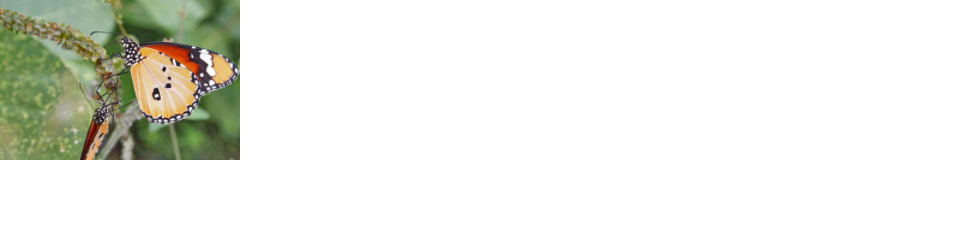
After typing out the above code, refresh in the browser and you see this single butterfly:
Add the .text-center class here to make all the text inside the boxes centered.
Add the following classes:
.link-box — makes the link display: block, to allow <div> tags inside, and removes the underlines from the text..relative — because we’ll be using position: absolute inside the link..crop — this will chop off the text labels because we want them to slide in when hovered.Some more styling classes here:
.island-1-4 — for a little space..w-1 — to make sure it fills all the way across..absolute — so we can position this with coordinates.Finally some styles for the heading itself—they’re pretty self-explanatory.
Though we can’t see the text, it will be white.
Make the text a little more legible—though we still can’t see anything.
Next up we’re going to add a hover state: when hovering the box the caption should become visible.
⋮
.hover-box-caption {
  bottom: -4em;
  background-image: linear-gradient(to bottom, rgba(0, 0, 0, 0), rgba(0, 0, 0, .5));
  text-shadow: 1px 1px 5px rgba(0, 0, 0, .9);
}

.hover-box:hover .hover-box-caption {
  bottom: 0;
}
Check it out in the browser:
It’s important to define an initial location for the caption, here we’re setting it below the bottom of the image. And therefore it will be cropped off because of the .crop class we added earlier.
When we hover anywhere on the .hover-box we want to target the caption and change it’s bottom position to 0, making it align to the bottom of the image now.
Now let’s make this a little fancy with a transition on the caption. The transition will allow the caption to animate into it’s location instead of just popping into place.
⋮
.hover-box-caption {
  bottom: -4em;
  background-image: linear-gradient(to bottom, rgba(0, 0, 0, 0), rgba(0, 0, 0, .5));
  text-shadow: 1px 1px 5px rgba(0, 0, 0, .9);
  transition: all .2s linear;
}
⋮
The transition property will allow any CSS numerical changes to animate. In this case only the bottom property changes, so it will be the thing that animates.
all properties that change will be animated..2s is the length of time the animation will take.linear is the type of easing, “linear” meaning “no easing”.Since this lesson is all about being “fancy” let’s fancify the image too. We’re going to make the image black & white, then when hovered it will become coloured and zoom in a little bit.
⋮
.hover-box-img {
  filter: grayscale(100%);
  transition: all .2s linear;
}

.hover-box:hover .hover-box-img {
  filter: grayscale(0);
  transform: scale(1.1);
}
The filter property allows us to add a bunch of different effects to all HTML elements, including text. Here we’re using the grayscale() filter to desaturate the image into black & white. The 100% specifies that we want complete greyscale, a lower percent would be less greyscale and have more colour.
Make sure to spell “gray” the American way.
Since the filter is a numerical property we can totally transition it too.
Undo the greyscale filter by setting it to 0
We can use the transform property to grow the image a little bit. The scale() function will allow us to grow or shrink HTML elements: 1 is what an element currently is, so 1.1 is just slightly larger.
Now that we have that single butterfly working it’s up to you to add the remaining butterflies.
Add the following butterflies in this order:
Each should be a new .unit inside the same <section> .grid
Try ’em out. They should work great since the CSS is already done.
If we Tab to each element in the browser we get the focus ring (the big black outline). It isn’t really ideal because it gets hidden behind the elements that come after.
So, with a little CSS we can make the focus ring work much better for keyboard navigation.
⋮
.hover-box:focus {
  z-index: 10;
}

⋮

.hover-box:hover .hover-box-caption,
.hover-box:focus .hover-box-caption {
  bottom: 0;
}

⋮

.hover-box:hover .hover-box-img,
.hover-box:focus .hover-box-img {
  filter: grayscale(0);
  transform: scale(1.1);
}
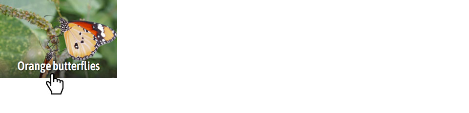
Wonderful! Some fancy-fied butterflies.
When the .hover-box is focused we want it to move to the top of the pile, so let’s give is a higher z-index
Add the :focus pseudo selector to the caption along with :hover—don’t forget the comma (,) between them!
Add the :focus pseudo selector to the image along with :hover—don’t forget the comma (,) between them!
Drop the final, coded exercise into Markbot and fix all the errors until Markbot gives you all green (and maybe a little yellow).
After you’ve fixed all the problems, go ahead and submit the assignment. You’ll immediately get your grade.