We’re going to explore how to use transitions to make fancy hover boxes where images go from greyscale to coloured and zoom in when hovered.
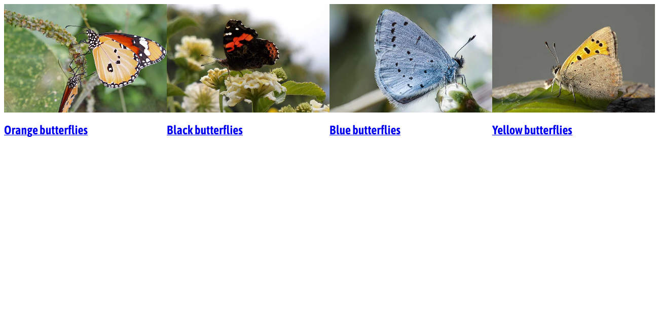
This is what it should look like when it’s done:
An exercise using transitions to create hover boxes that fade from black & white to colour.
We’re going to explore how to use transitions to make fancy hover boxes where images go from greyscale to coloured and zoom in when hovered.
This is what it should look like when it’s done:
Remember the purpose of this lesson is to type the code out yourself—build up that muscle memory in your fingers!
Start the lesson by forking and cloning the fancy-hover-boxes repository.
Fork & clone the “fancy-hover-boxes” repo.
The repository will have some starter files to get you on your way and include requirements for Markbot so you can be sure you’ve completed the lesson.
This includes some starter code that you can get by forking and cloning the repository. You’ll use Markbot to double check everything is done properly.
After forking & cloning the repository to your computer you should have the following files:
There’s also some HTML & CSS already coded so we can concentrate completely on making the hover boxes work.
The HTML boilerplate already exists for us, we just need to write the hover box HTML. Open up index.html and we’ll add in the HTML for the hover boxes.
⋮
<body>

  <section>
    <a class="hover-box" href="#">
      <img src="images/orange.jpg" alt="">
      <h2>Orange butterflies</h2>
    </a>
    <a class="hover-box" href="#">
      <img src="images/black.jpg" alt="">
      <h2>Black butterflies</h2>
    </a>
    <a class="hover-box" href="#">
      <img src="images/blue.jpg" alt="">
      <h2>Blue butterflies</h2>
    </a>
    <a class="hover-box" href="#">
      <img src="images/yellow.jpg" alt="">
      <h2>Yellow butterflies</h2>
    </a>
  </section>

</body>
⋮
If we were to refresh in the browser right now we’d see some text & images. So we need a little CSS.
Notice the .hover-box class is on the <a> tag—we’ll be styling that later.
Let’s create the basic grid to lay out the butterfiles in their boxes.
⋮
section {
  display: grid;
  grid-template-columns: repeat(auto-fit, minmax(20rem, 1fr));
}
After typing out the above code, refresh in the browser and you see this row of butterflies:
We’ll use repeat() and auto-fit & minmax to get the browser to intrinsically layout the boxes in a row.
Before we can make any transitions, we need to get the image & caption looking nice.
⋮
.hover-box {
position: relative;
overflow: hidden;
text-decoration: none;
color: #fff;
}
.hover-box h2 {
position: absolute;
bottom: 0;
width: 100%;
padding: 1rem;
margin: 0;
text-align: center;
background-image: linear-gradient(to bottom, rgba(0, 0, 0, 0), rgba(0, 0, 0, 0.5));
text-shadow: 1px 1px 5px rgba(0, 0, 0, 0.9);
}
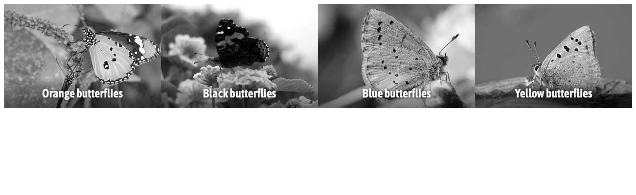
.hover-box img {
filter: grayscale(100%);
}
Check it out in the browser:
Make the hover box position relative so it can contain the caption inside.
Chop off anything that exists outside the hoverbox: this will be important later.
Use position absolute & coordinates to get our heading into the right place.
The filter property allows us to add a bunch of different effects to all HTML elements, including text. Here we’re using the grayscale() filter to desaturate the image into black & white. The 100% specifies that we want complete greyscale, a lower percent would be less greyscale and have more colour.
Make sure to spell “gray” the American way.
Let’s use some CSS positioning & hover effects to make the captions disappear & reappar.
⋮
.hover-box h2 {
  position: absolute;
  bottom: -4em;
  width: 100%;
  padding: 1rem;
  margin: 0;
  text-align: center;
  background-image: linear-gradient(to bottom, rgba(0, 0, 0, 0), rgba(0, 0, 0, 0.5));
  text-shadow: 1px 1px 5px rgba(0, 0, 0, 0.9);
}

.hover-box:hover h2,
.hover-box:focus h2 {
  bottom: 0;
}

.hover-box img {
  filter: grayscale(100%);
  transition: all 0.2s linear;
}
Make the bottom coordinate of the caption a negative number, therefore shoving it off the bottom.
Because we added overflow: hidden earlier, we can’t see the caption any more.
Add hover & focus effects to the .hover-box, targetting the <h2> and reset it’s bottom coordinate to 0.
Now let’s make this a little fancy with a transition on the caption. The transition will allow the caption to animate into it’s location instead of just popping into place.
⋮
.hover-box-caption {
  background-image: linear-gradient(to bottom, rgba(0, 0, 0, 0), rgba(0, 0, 0, 0.5));
  text-shadow: 1px 1px 5px rgba(0, 0, 0, 0.9);
  transition: all .2s linear;
}
⋮
The transition property will allow any CSS numerical changes to animate. In this case only the bottom property changes, so it will be the thing that animates.
all properties that change will be animated..2s is the length of time the animation will take.linear is the type of easing, “linear” meaning “no easing”.Since this lesson is all about being “fancy” let’s fancify the image too. We’re going to make the image black & white, then when hovered it will become coloured and zoom in a little bit.
⋮
.hover-box img {
  filter: grayscale(100%);
  transition: all .2s linear;
}

.hover-box:hover img,
.hover-box:focus img {
  filter: grayscale(0);
  transform: scale(1.1);
}
Wonderful! Some fancy-fied butterflies.
Since the filter is a numerical property we can totally transition it too.
Undo the greyscale filter by setting it to 0
We can use the transform property to grow the image a little bit. The scale() function will allow us to grow or shrink HTML elements: 1 is what an element currently is, so 1.1 is just slightly larger.
Drop the final, coded exercise into Markbot and fix all the errors until Markbot gives you all green (and maybe a little yellow).
After you’ve fixed all the problems, go ahead and submit the assignment. You’ll immediately get your grade.