With so many different screen sizes and resolutions we need to prepare our images so they are crisper and clearer and still small to download.
Choosing the right format
There are a few considerations to make when choosing the image format to save to make the image work best at different screen dimensions & resolutions. This flow-chart will help you determine the best image format to use.
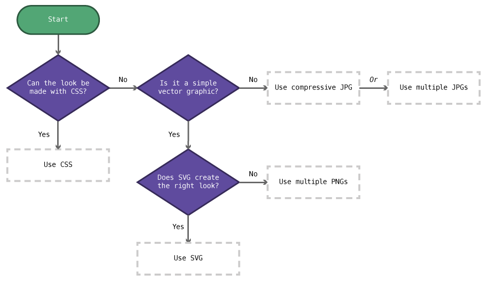
- Can the look be accomplished practically in CSS?
Yes: Use CSS. - Is it a simple vector-like graphic (logo, icon, illustration)?
Yes: Can the look be accomplished with SVG?- Yes: Use SVG.
- No: Use multiple PNGs.
- For complex graphics:
Use compressive JPGs. or: Use multiple JPGs.
Choosing the right implementation
There are lots of techniques we can use to display images for different screen dimensions & resolutions. This flow-chart will help you determine the best technique.
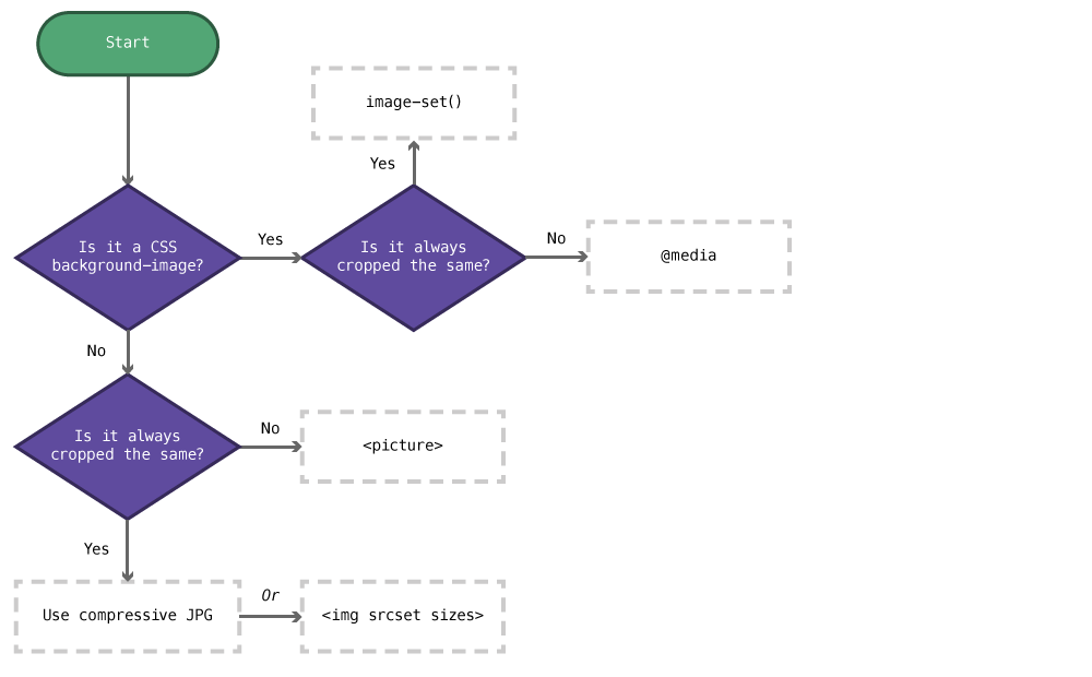
- Is it a CSS background-image?
Yes: Is it always cropped the same?- Yes: Use
image-set()instead ofurl() - No: Use different
@mediadeclarations.
- Yes: Use
- For foreground images: Is it always cropped the same?
Yes: Use compressive JPGs. or: The<img srcset sizes>attributes.
No: Use the<picture>element.
CSS
Anything done in CSS is naturally retina friendly. So, if you can accomplish the look in CSS alone, do it with CSS.
Some good examples of when CSS works well:
- Gradients, shadows, rounded corners
- Web fonts, text shadows
Some bad examples of when CSS shouldn’t be used, primarily because of memory concerns:
- Icons & illustrations
- Extremely complex gradients
SVG
SVG graphics are also inherently retina friendly. If you have a simple graphic and SVG can produce a good result, use SVG.
Don’t use SVG for extremely complex graphics (because of memory concerns) and don’t use SVG for photos.
Compressive JPGs
Compressive JPGs are a technique for supplying hi-resolution photos while reducing the download size.
The major downside of this technique is that the images can become very memory intensive.
Creating compressive JPGs
- Go to your website and, using the developer tools, determine the maximum width your image will be displayed at,
- Open the original source file in Photoshop and make its width double the size you determined for your website,
- Use
Save For Webto compress the image to a JPG with a quality of somewhere around 20%–30%.
Then, when sizing your JPG to the appropriate dimensions in the your website, it will actually be double the pixel width and shrunken down by the browser, therefore displayed crisply.
(retina width) = (display width in browser) * 2
No image, displayed on a website, should ever be larger than 2500px or 300kB.
Links
PNGs
Sometimes SVG graphics don’t produce the result you want for icons yet you still want to provide crisp graphics for hi-res screens.
First, similar in technique to compressive JPGs, just make a double size PNG and scale it down in your website—either using an <img> tag or background-image.
If that’s too memory intensive, or creates too large of a file, try some of the below techniques.
Image tag source sets
There are attributes—srcset & sizes—on the <img> tag that allow us to provide different versions of our images and the browser will determine which image to show on the screen.
The use-case for the <img> tag with these new attributes is to provide different resolutions of the exact same image and the browser will pick the one that best fits the screen.
srcset— allows us to define all the different possible sizes of images, and their native pixel width (like from Photoshop). It’s best to start at the largest and go backwards.sizes— allows us to define how much of the screen width the image will take up at different media queries. Think of it like media queries specifically for the individual image. It’s best to start at the largest size and go downwards.
Both of these attributes must be coded.
<!-- This is written on multiple lines for clarity only -->
<img
  src="small.jpg"
  srcset="large.jpg 2000w, medium.jpg 1000w, small.jpg 320w"
  sizes="(min-width: 60em) 33.3333vw, (min-width: 38em) 50vw, 100vw"
  alt="A giant squid swimming deep in the sea"
>
In the above srcset attribute we’re telling the browser there are 3 different images to pick from:
large.jpgwhich has the pixel width of2000medium.jpgwhich has the pixel width of1000small.jpgwhich has the pixel width of320
In the above sizes attribute we’re telling the browser that the image will be displayed 3 different ways:
- At a screen width of at least
60emthe image will take up33%of the width of the viewport (vw). - At a screen width of at least
38emthe image will take up50%of the viewport. - Any other screen width the image will take up the whole width of the viewport.
Given all this information about the images the web browser will choose whichever image it deems best to be displayed.
Alternative text
Don’t forget that the alt="" attribute is still required and needs to still describe the image properly. Since the different image sources should all essentially be a single image, the alt only needs to describe the image as though it’s just one graphic.
Backwards compatibility
Make sure to always still specify the src attribute—you can see that’s the first thing specified above. This is for backwards compatibility, so the <img> tag still works on browsers that don’t support the new attributes.
The src attributes should always point to the smallest image possible.
Links
Picture element
There’s an HTML element for managing and targeting different graphics to different screen sizes: the <picture> element.
The <picture> element is specifically targeted at art direction: serving differently framed and cropped images to different screen sizes.
When using <img srcset sizes> the browser will use it’s own judgment to choose an image—the <picture> element dictates to the browser exactly which image to select.
<picture>
  <!-- Put the biggest at the top, because the first appropriate one will be selected -->
  <source media="(min-width: 60em)" srcset="large.jpg">
  <source media="(min-width: 38em)" srcset="medium.jpg">
  <img src="small.jpg" alt="A giant squid swimming deep in the sea">
</picture>
The <picture> tag is a wrapper around many different <source> tags. Each <source> tag specifies a media query of when that image should be displayed.
In the example above we have three possibilities:
- If the screen width is at least
60emthelarge.jpgwill be shown. - If the screen width is at least
38emthemedium.jpgwill be shown. - Otherwise the
small.jpgwill be shown.
Backwards compatibility
Make sure to always include an <img> tag as the last item inside the <picture> element. This serves two purposes:
- It serves as the smallest possible image that can be displayed.
- Backwards compatibility: if the browser doesn’t support
<picture>the<img>tag will be shown instead.
The <img src> should always point to the smallest image possible.
Retina resolutions
We can also provide different resolutions of all the images inside the <picture> element using a technique similar to the <img srcset>:
<picture>
  <source media="(min-width: 60em)" srcset="large-@2x.jpg 2x, large.jpg 1x">
  <source media="(min-width: 38em)" srcset="medium-@2x.jpg 2x, medium.jpg 1x">
  <img src="small.jpg" srcset="small-@2x.jpg 2x, small.jpg 1x" alt="A giant squid swimming deep in the sea">
</picture>
Notice we now include multiple images in each srcset attribute. The difference in this case is we don’t specify the pixel width of the image, instead we specify the resolution denoted with the x.
So for each image with have an original resolution, like large.jpg 1x and a high/double resolution, like large-@2x.jpg 2x
Alternative text
Don’t forget that the alt="" attribute on the internal <img> is still required and needs to still describe the image properly. Since the different image sources should all essentially be a single image, the alt only needs to describe the image as though it’s just one graphic.
Links
Background images
For background images in CSS, we can use a media query for detecting hi-res screens and supply two different images in our CSS.
<i class="icon"></i>
.icon {
  display: inline-block;
  width: 32px;
  height: 32px;
  background-image: url("../images/icon.png");
}

@media (min-resolution: 144dpi) {

  .icon {
    background-image: url("../images/icon@2x.png");
    background-size: 32px 32px;
  }

}
Or you can try out the new image-set() function—which doesn’t have very good browser support yet.
Links
- Retina media queries: https://gist.github.com/3855791
- Media Query Asset Downloading Results
- Can I use: resolution media query
- Can I use: image-set
- Background image-set
Video list
- Responsive & retina images: Compressive JPGs
- Responsive & retina images: Multi-resolution PNGs
- Responsive & retina images: Image source sets
- Responsive & retina images: Picture tag
- Responsive & retina images: Retina-ready picture tag
Supplemental links
- A List Apart: Responsive Images in Practice
- Responsive Images 101: Part 1, Part 2, Part 3, Part 4, Part 5, Part 6, Part 7, Part 8, Part 9
- Responsive Images Community Group
- Smashing Magazine: Responsive Images Done Right: A Guide To picture And srcset
- The web, performance, retina images
- Srcset and sizes
- Sizer Soze