CSS Grids are a modern web friendly layout engine for our web designs.
They provide us with exceptional control over layouts & placements for our websites—even simplifying flexible/reponsive design in many ways.
2D
CSS Grids are a two-dimensional layout framework: using both columns & rows.
We can explicitly specify columns and rows but the browser will also do some magic and implicitly create columns and rows for us.
Terminology
There are a few key terms we need to know for working with grids.
- Line — The horizontal or vertical breaks within a grid structure.
- Cell — The box surrounded by multiple grid lines.
- Track — A grouping of grid cells.
- Column — A grouping of grid cells on the vertical axis.
- Row — A grouping of grid cells on the horizontal axis.
- Area — A bundle of vertical and/or horizontal grid cells.
Creating a grid
To create a grid, target an element and add display: grid—all the immediate child elements will move onto the grid.
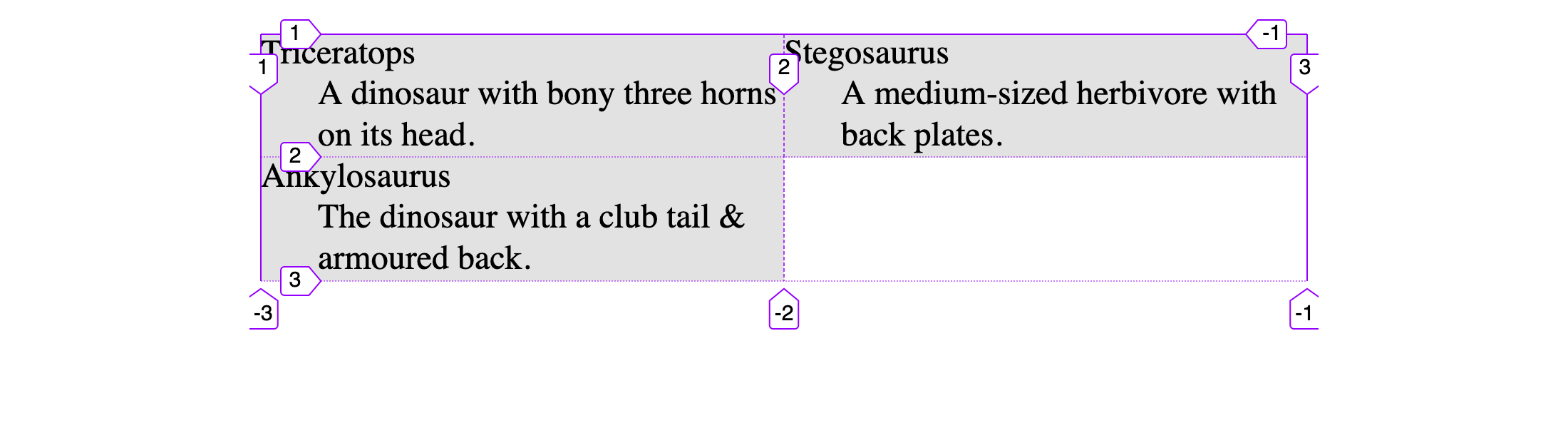
Let’s use this simple HTML, to help us see how grid works.
<dl>
  <div>
    <dt>Triceratops</dt>
    <dd>A dinosaur with bony three horns on its head.</dd>
  </div>
  <div>
    <dt>Stegosaurus</dt>
    <dd>A medium-sized herbivore with back plates.</dd>
  </div>
  <div>
    <dt>Ankylosaurus</dt>
    <dd>The dinosaur with a club tail & armoured back.</dd>
  </div>
</dl>
If we target that element in CSS, and use display: grid, the magic happens.
dl {
  display: grid;
}
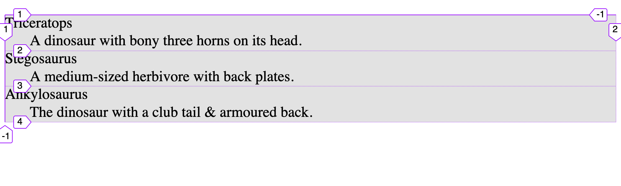
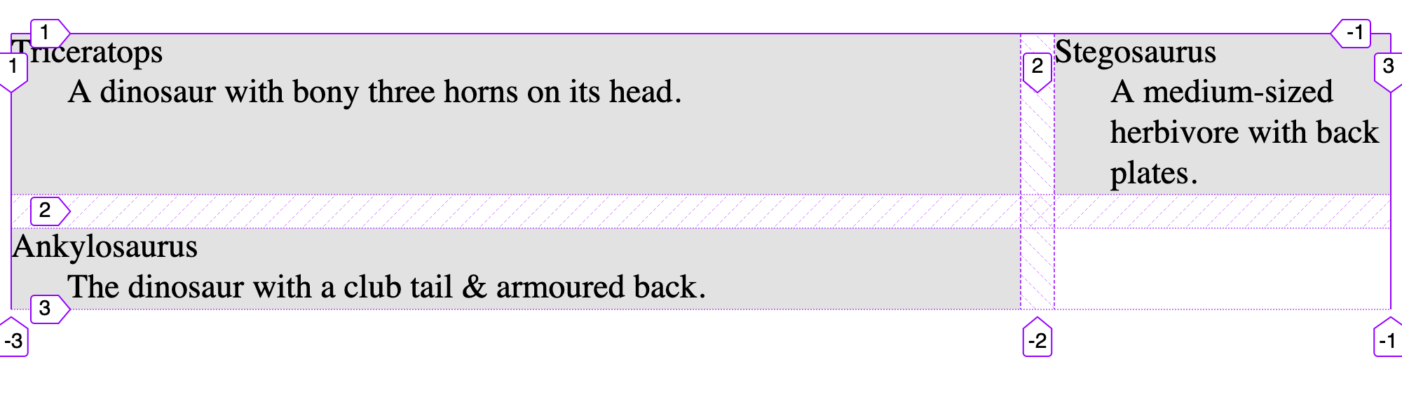
Now, it doesn’t look like much. But the browser has implicitly & automatically create 1 column & 3 rows.
Defining rows & columns
To define columns & rows, we can use grid-template-columns & grid-template-rows
dl {
  display: grid;
  grid-template-columns: 1fr 1fr;
}
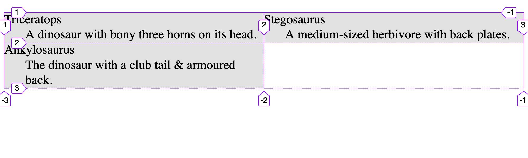
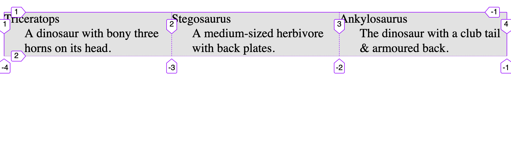
We get two columns, defined by our grid-template-columns property. And the browser automatically creates a new row for us.
1fr is a new unit that means 1 fraction of the free space. If we want one of the columns a little wider we could give it more of the available free space.
dl {
  display: grid;
  grid-template-columns: 3fr 1fr;
}
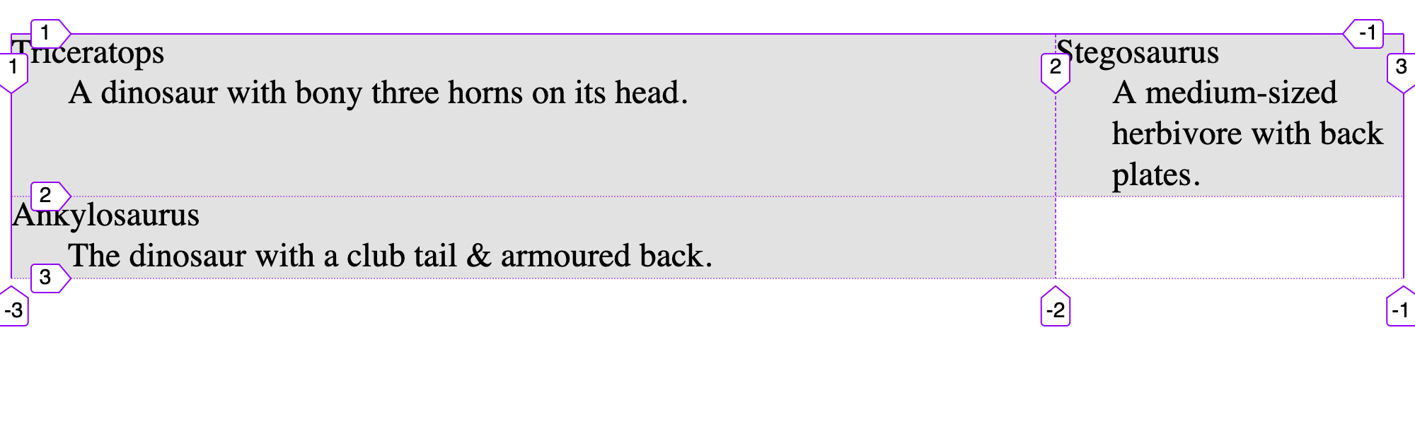
We can also use standard units like px, rem, %, etc.
grid-template-rows works the same way but for defining rows horizontally down the page.
Gaps
We can very easily add spacing between the elements using the gap property:
dl {
  display: grid;
  grid-template-columns: 3fr 1fr;
  gap: 1rem;
}
You can also specify just column-gap or row-gap—for adjust the gap in individual dimensions.
Repeats
We can simplify our syntax just a little by using the repeat() function.
dl {
  display: grid;
  grid-template-columns: repeat(3, 1fr);
}
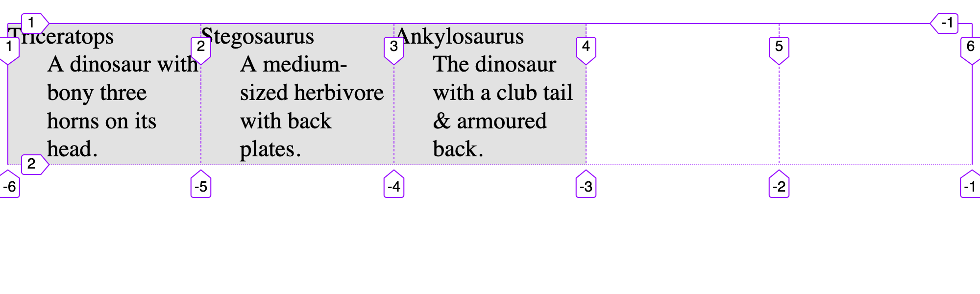
Now, arguably this isn’t much less code. It says “Repeat, for 3 times, 1fr”—creating us 3 columns.
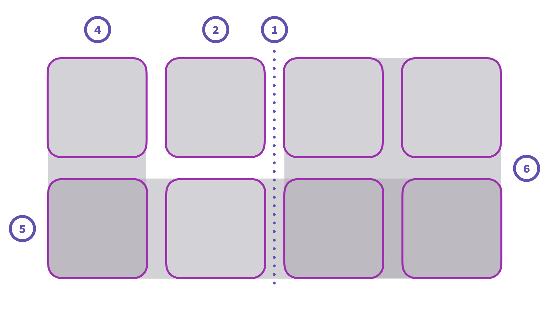
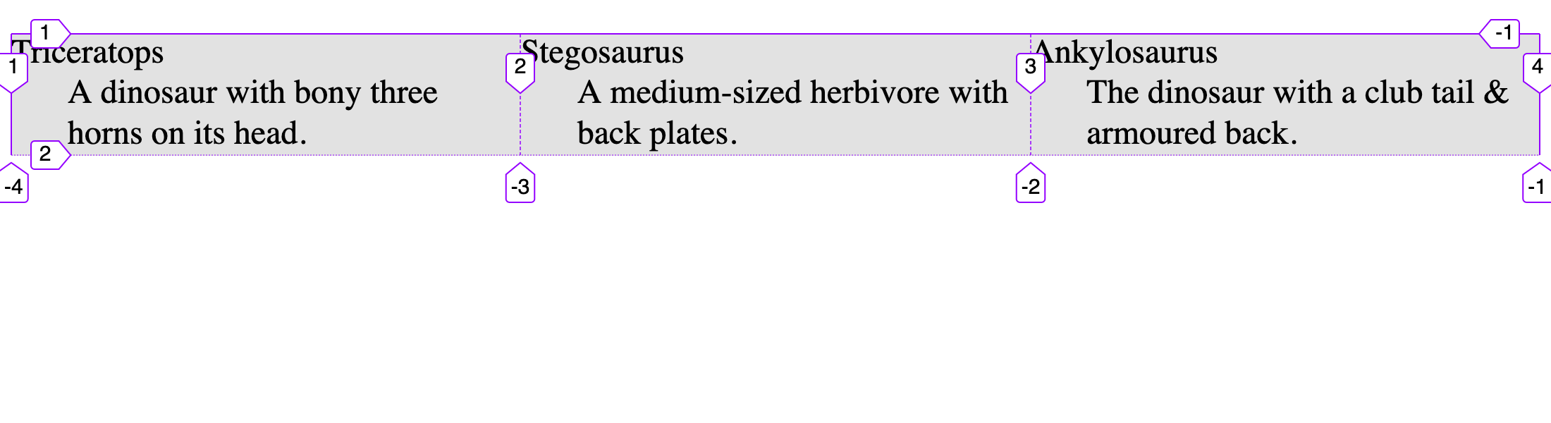
Moving elements
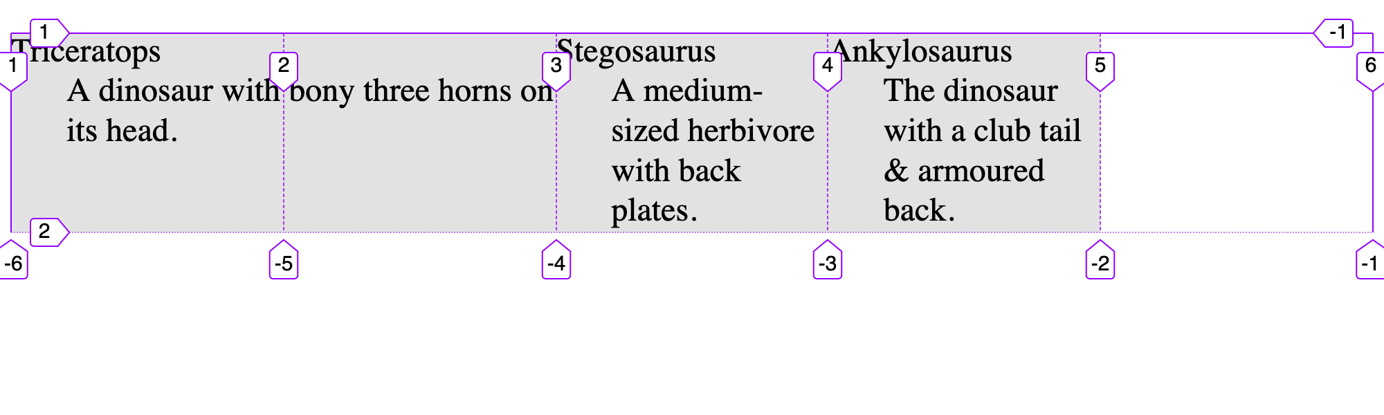
Let’s make a new example here, with 5 total columns:
dl {
  display: grid;
  grid-template-columns: repeat(5, 1fr);
}
You can see that the elements fall into the first 3 columns.
With the developer tools, as you can see in the image above, each grid line is numbered. We can move the elements around using those grid lines.
For “Triceratops”, let’s say I want to to be wider, I could have it start at line 1 and end at line 3.
dl > div:nth-child(1) {
  grid-column: 1 / 3;
}
Using the grid-column property we can choose a start & end line number, separated by a slash.
We can even rearrange elements. I want to move “Stegosaurus” from line 4 to the end. I could write this:
dl > div:nth-child(2) {
  grid-column: 4 / -1;
}
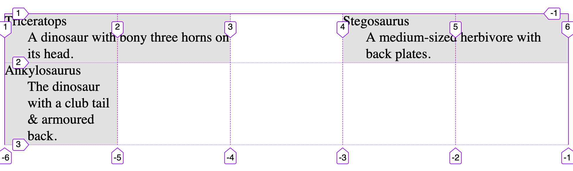
In this case, -1 refers to the very last line, we don’t have to know how many there are.
We also, magically got a new row! Let’s try moving along rows too!
dl {
  display: grid;
  grid-template-columns: repeat(5, 1fr);
  grid-template-rows: repeat(5, 1fr);
}

dl > div:nth-child(3) {
  grid-column: 3;
  grid-row: 2 / -1;
}
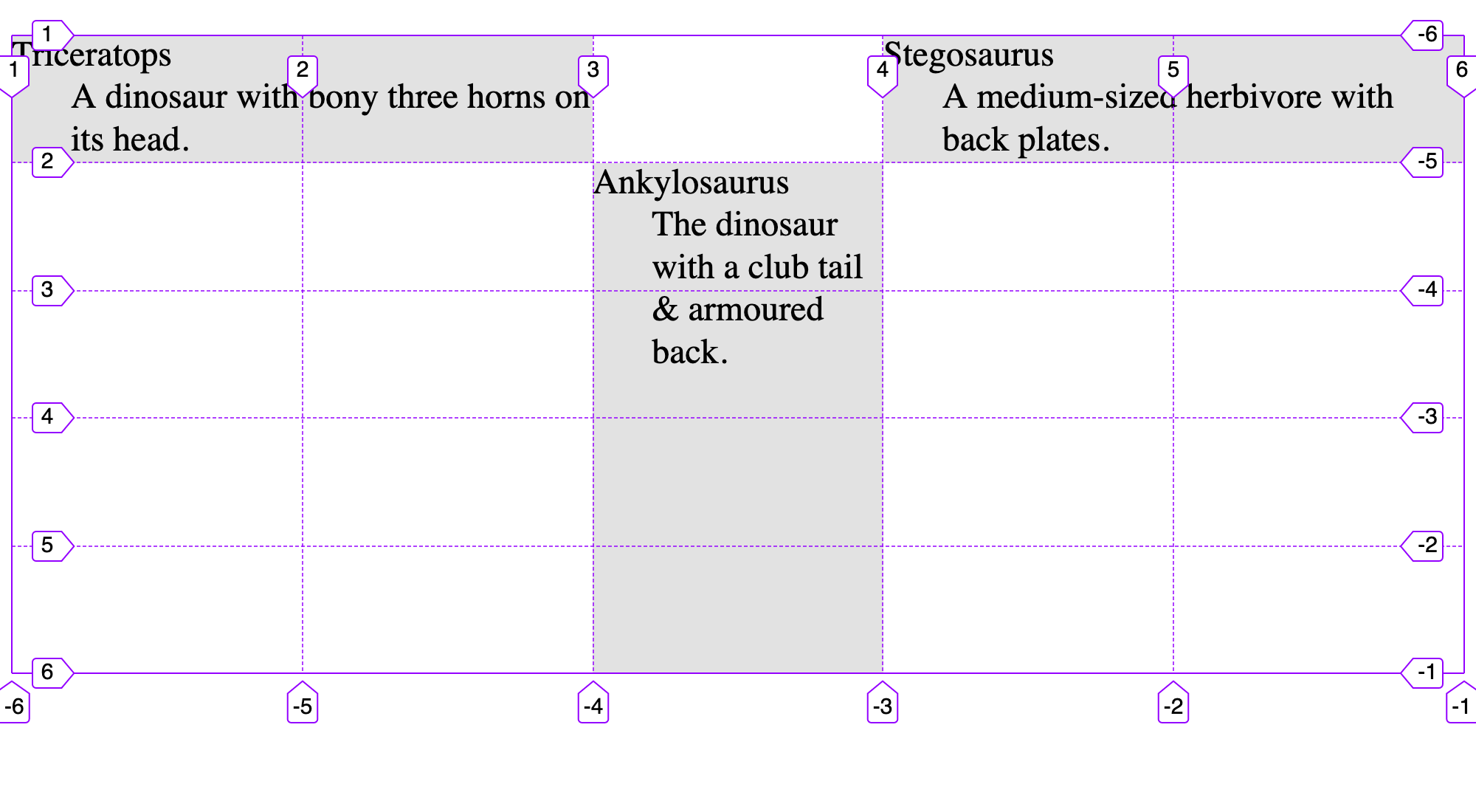
Notice how we first explicitly forced the grid to have 5 rows.
Defining areas
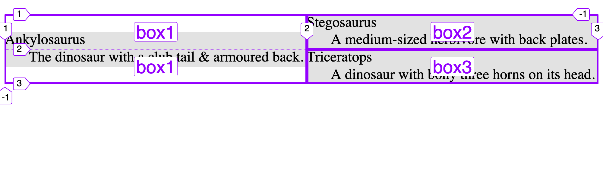
We can also use a more illustrative way to define columns & rows: areas:
dl {
  display: grid;
  grid-template-areas:
    "box1 box2"
    "box1 box3";
}
In the example above, we’ve created 2 columns & 2 rows. Each grouping of quotes is a row & each label within the quotes is a column.
- The first row is
"box1 box2" - The second row is
"box1 box3"
Notice how I repeated the names. We’re stretching box1 over 2 rows. Let’s check this out.
We can then use the grid-area property to move any element we want into any specific area:
dl > div:nth-child(1) {
  grid-area: box3
}
dl > div:nth-child(2) {
  grid-area: box2;
}
dl > div:nth-child(3) {
  grid-area: box1;
}
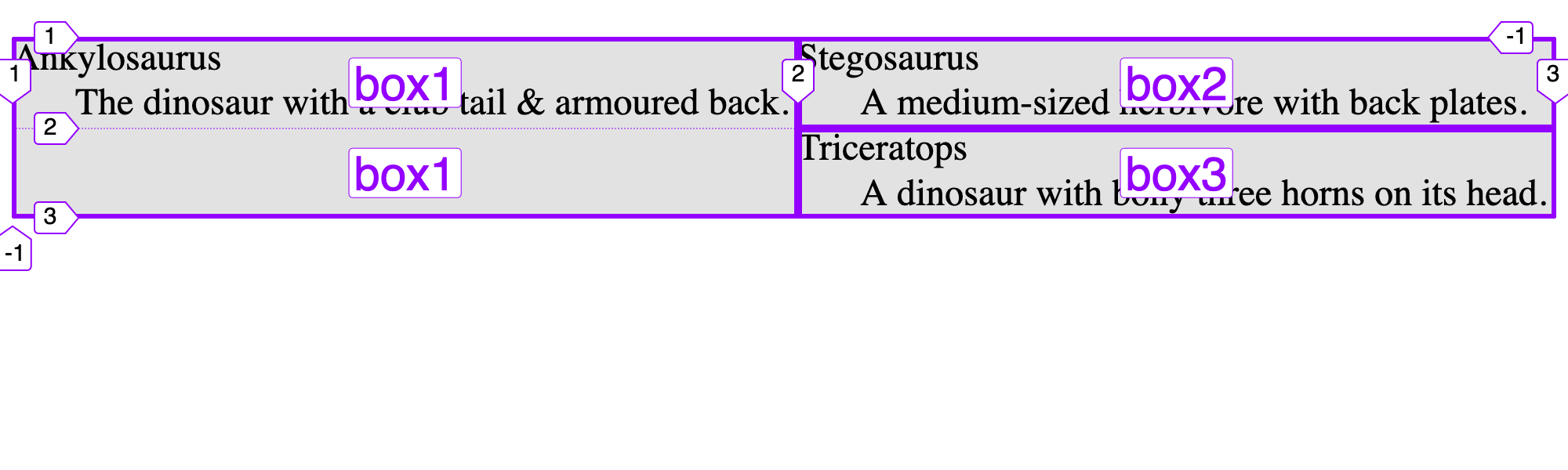
The order of the HTML elements doesn’t matter in our code—we can move things wherever visually we want. But the HTML code is still the order used for accessibility purposes.
Alignment
Using the same properties as Flexbox, we can move the elements around in their assigned areas.
dl > div:nth-child(3) {
  grid-area: box1;
  align-self: center;
}
All of these properties do things:
justify-content— align all the cells horizontally in the grid togetherjustify-items— align things horizontally within their grid areaalign-content— align all the cells vertically in the grid togetheralign-items— align things vertically within their grid areaplace-content— does bothjustify&alignat the same timeplace-items— does bothjustify&alignat the same time
Overlapping
Take everything to the next level by overlapping elements on the screen. It’s a great way to make banners.
<div class="banner>
  <h2>Chickpeas = Hummus</h2>
  <img src="images/chickpeas.jpg" alt="">
</div>
.banner {
  display: grid;
  grid-template-columns: 1fr 1fr 1fr;
  grid-template-rows: auto 4em;
}

img {
  grid-column: 1 / -1;
  grid-row: 1 / -1;
}

h2 {
  grid-column: 1 / -1;
  grid-row: 2;
  z-index: 1;
}
You can assign the same elements to the same grid areas & tracks—where they’ll naturally overlap.
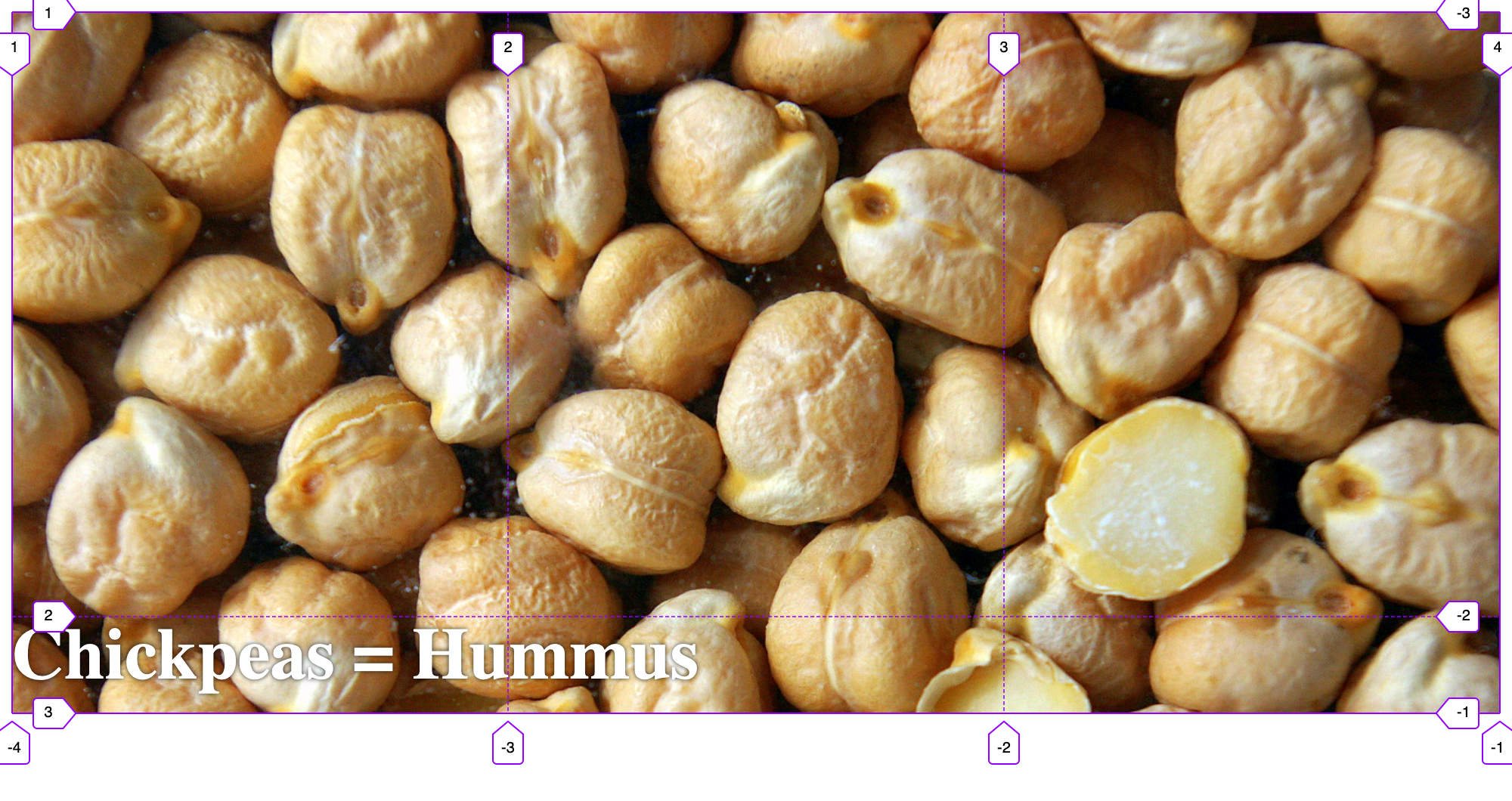
We do have to be aware of the stacking order. Because the <h2> comes before the <img> in the HTML source code order it will naturally be under the <img>.
To get the <h2> on top of the <img> we need to increase the z-index—the CSS property that controls layer stacking. The higher the number the closer to you & higher up in the layer order.
Grids & media queries
Combining grids with media queries we can create responsive & flexibly layouts really easily—especially if we combine it with grid areas.
<body>
  <header>Header</header>
  <main>Main</main>
  <aside>Sidebar</aside>
  <footer>Footer</footer>
</body>
Here’s a really simple set of HTML to make a web design. Let’s first create the small screen.
body {
  display: grid;
  grid-template-columns: 1fr;
  grid-template-areas:
    "header"
    "main"
    "sidebar"
    "footer";
}
header {
  grid-area: header;
}
main {
  grid-area: main;
}
aside {
  grid-area: sidebar;
}
footer {
  grid-area: footer;
}

All these elements will stack because of the grid area we created.
To completely change the layout, all we need to do is redefine the columns and areas inside a media query.
@media only screen and (min-width: 60em) {

  body {
    grid-template-columns: 15rem auto;
    grid-template-areas:
      "header  header"
      "sidebar main"
      "footer  footer";
  }

}
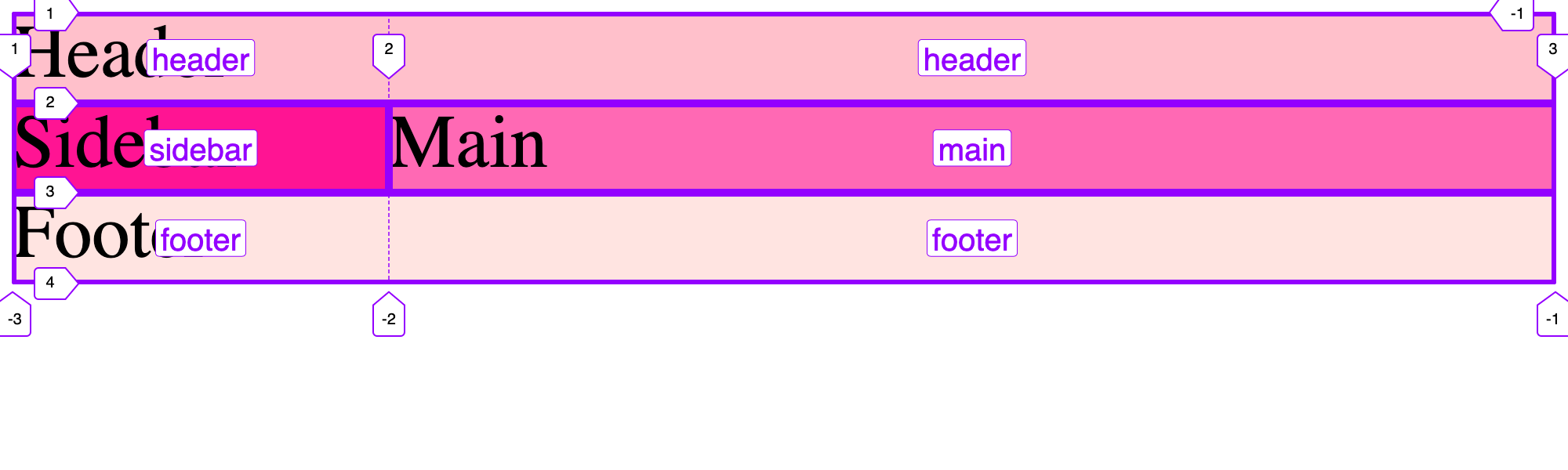
We can even rearrange things—notice how the “sidebar” comes visually before the “main” section.
Intrinsic layouts
But why use media queries when we can do a lot with just grid. repeat in combination with a few other things, can give us amazing power. Try this one out:
dl {
  display: grid;
  grid-template-columns: repeat(auto-fit, minmax(15rem, 1fr));
}

This one line gives us a flexible layout that adapts to the available space & changes as necessary.
Let’s break down the components a little bit:
repeat— Do this sizing many timesauto-fit— Automatically scale the elements up as necessaryminmax— The minimum size is15rem& the maximum size is1fr
There is one small problem, looking at the smallest screen-size we can see that the text is getting cut off.
We hit the minimum size of 15rem, but really we want to allow it to scale below that too.
With some more complexity we can do that, changing 15rem to use the min function:
dl {
  display: grid;
  grid-template-columns: repeat(auto-fit, minmax(min(15rem, 100%), 1fr));
}

min says choose which of these two is smaller: 15rem or 100%. On the smallest screen size, 100% is chosen.
So our min max ends up being between 100% and fr. Then on larger screens, when 100% becomes more than 15rem, the 15rem is chosen instead.
Display contents
There’s a nice little trick we can do with display: contents—but in some browsers it has some accessibility concerns. (They’re getting fixed though.)
<body>
  <main>
    <h1>Stegosaurus</h1>
    <p>Back plates that aren’t made for eating off.</p>
  </main>
</body>
body {
  display: grid;
  grid-template-columns: repeat(5, 1fr);
}

h1 {
  grid-column: 3 / 5;
}
Remember that grid works only on immediate child elements. With the example above, we cannot actually move the <h1> onto the body tag’s grid because it’s within the <main> tag. Only the <main> tag can be put onto the grid.
But if we add this:
main {
  display: contents;
}
The “contents” display remove the <main> tag from the tree, therefore leaving the <h1> and <p> exposed to the grid.
Do be careful, some browsers don’t fully support this and provide incorrect accessibility information.
In the future, an alternative approach will be Subgrid.
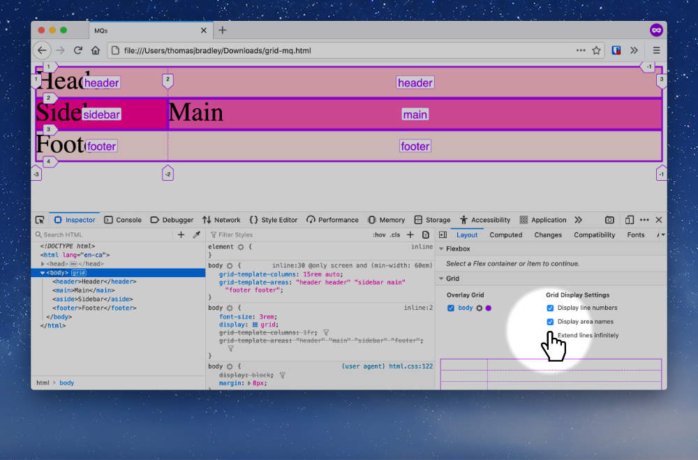
Developer tools
Firefox has the most amazing grid (& flexbox) tools in the developer tools.
When you’re in the Web Inspector—it shows a little “grid” button beside the element. If you click that it will open the grid inspector.
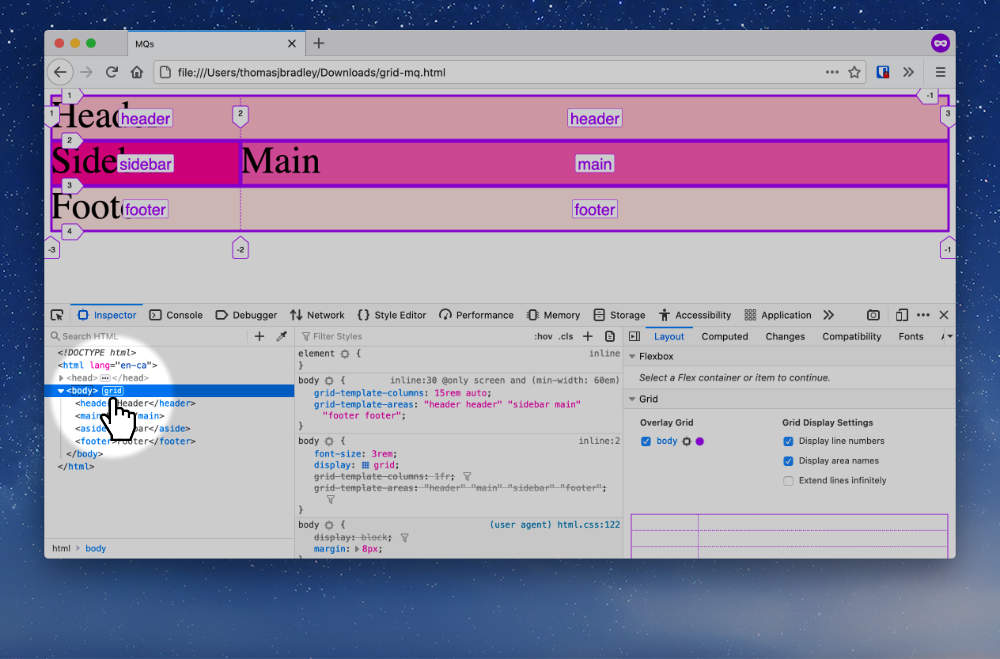
Make sure you enable “Display area names” to make it more useful.
Video list
- CSS grids: Setup
- CSS grids: Developer tools
- CSS grids: Moving elements
- CSS grids: Grid areas
- CSS grids: Overlapping elements
- CSS grids: Media queries
- CSS grids: Auto-fit