Accessibility is important: not only because its the law, but because we care. Not everybody access The Web or uses computers the same way you do. We don’t want the thing we create to prevent them from completing their task.
With a little consideration & forethought we can make our website design work for every human on the planet.
Font sizes
Always test that your website works with different font sizes.
- 2 sizes up & 2 sizes down
- People prefer different sizes of text—our design shouldn’t break when the text changes size.
Testing font sizes
In Firefox, go to the menu: View > Zoom & enable Zoom Text Only
⌘+— Increases font size⌘-— Decreases font size⌘0— Sets the default font size
When increasing & decreasing font-sizes we’re specficically looking of layout breaks:
- Text popping out of its box
- Overlapping text
- Things moving off screen
Length & justification
Always consider the text’s line-length & justification.
There’s a good averagle line-length that works well for many humans: 45–75 characters.
- If the line-length is too long it gets difficult to follow from line-to-line.
- If the line-length is too short it causes too much lateral eye movement.
Don’t full justify text on The Web—many people find it difficult to read. The ragged edges of non-justified text helps people move their eyes from line to line. Because the lines are different lengths they can more easily discover what line they are viewing & which line comes next.
Link obvious-ness
Always make links extremely obvious—ideally underlined (navigation bar exempted)**
We want to help people scan the page for the information they’re looking for. Distinguished links grab & guide eye movement.
Don’t rely on colour distinction alone—not everyone can see the colour difference. People with colour-blindness, as an example, may not be able to distinguish the link colour from the surrounding body text colour.
You can change how the underline looks! (Some of these properties are so new they only work in Firefox.)
a {
  text-decoration: underline;
  text-decoration-color: hotpink;
  text-decoration-thickness: .3em;
  text-underline-offset: .2em;
}
Link hit area
Always make links have the largest hit areas possible.
Moving a mouse is difficult for many people—the bigger the box we can provide for clicking, the easier it is to target.
Navigation & buttons should be extra large, especially for big thumbs & mobile screens. You’ve all felt the frustration of trying to accurately hit a too-small button on your mobile device.
Keyboard focus styles
Always style the selected control in an obvious manner.
Not everybody is capable of using a mouse, or even chooses not to use a mouse. But they still need to be able to navigate your website—and keep their position.
Focus styles highlight the currently selected element on screen so it’s recognizable as keyboard focused control.
The first step is to duplicate your hover styles as focus styles:
a:hover,
a:focus {
  background-color: hotpink;
}
The second thing that all browsers provide—by default—is the focus rectagle. We can style the focus rectangle with the outline property.
It’s important to not remove the keyboard focus rectangle from links, but it can be styled for better contrast or to match your website.
a:focus {
  outline: .15em solid #000;
  outline-offset: .2em;
}
But don’t ever write outline: none; on the :focus state—it’s an extremely important feature for keyboard users.
Always confirm that the colour of the focus rectagle has enough contrast against its background.
Colour contrast
Always test colours for contrast—helping people with colour blindness.
Without enough contrast text may become unreadable when people have different types of vision.
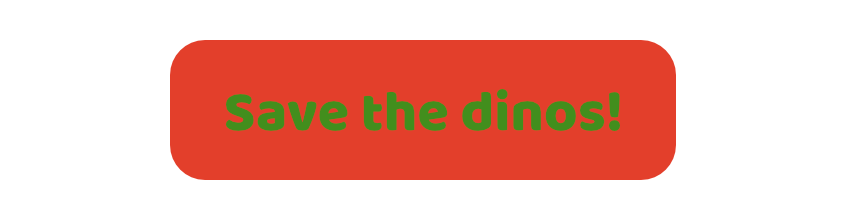 Someone with average vision may see these colours.
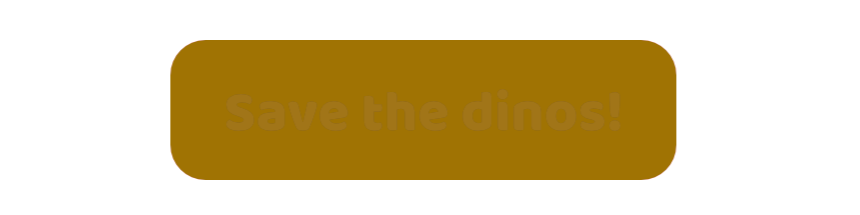 But, someone with red-green colour blindness might see no text.
 Or, they might find the contrast between the text & colour very hard to distinguish.
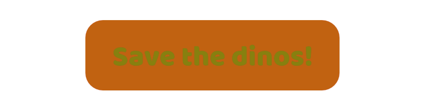
 Blue-yellow colour blindness example.
It’s okay if people see different colours—it’s most important that they can read the text & distinguish things comfortably.
Missing images
Always test your design without images.
Some people choose to disable images:
- To prevent flashing images that may induce seizures
- Because they find the images distracting
- Because they have a slow internet connection
Whether images load or not, all the text content should still be vislble and distinguishable.
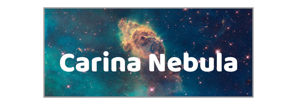 An example with text over an image: the text is very legible—white text on a dark image.
 When the dark coloured image disapears we’re left with light text on a light background—making it impossible to read.
 A simple solution is to add a background colour to the box, so when the image disappears, we still have the background color to provide contrast for the text.
Janky designs
Always make sure important landmarks don’t move.
Some people find it difficult to use websites if the important controls are always jumping around.
It’s often easier to remember “where” something is than what that thing is called or labeled.
These things should never change location:
- Logo & company name
- Navigation & link to home
- Important buttons
- Search
- User controls: sign in/out
Hidden & visually hidden
Always be careful when hiding things in your website.
If you want to hide something from everybody do one of these two things:
1 — Use the hidden attribute:
<div hidden>Stuff not visible</div>
2 — Use CSS, display: none:
.hide {
  display: none;
}
Both [hidden] and display: none will comlpetely hide something—from sighted users & from screen readers.
Sometimes you want to hide something only from visual users, in that case we need some special CSS: the .visually-hidden class:
.visually-hidden {
  height: 1px;
  margin: -1px;
  overflow: hidden;
  padding: 0;
  position: absolute;
  width: 1px;
  border: 0;
  clip: rect(0 0 0 0);
  clip-path: inset(50%);
}
This is a utility class you can copy-and-paste into every design you use. It will hide something visually on-screen, but still allow screen readers to access and read out its contnet.
Skip links
Always provide alternative methods for moving around a website via keyboard.
It’s a good idea to add skip links to a website for jumping over the navigation to the main content. Or adding a skip link to jump from the bottom to the top of the website.
Skip links are just standard internal links that jump down to a specific point of a page.
<a href="#main">Jump to main content</a>

⋮

<main role="main" id="main"></main>
Most often designers like to hide them but they must be hidden in an accessible manner. Hidden by default but when focused, shown again.
.skip-links a {
  position: absolute;
  top: -3em;
}

.skip-links a:focus {
  top: 0;
}