Designing form errors

Write up code for accessible, well designed form error messages with a little JavaScript to help.

Goal

We’re going to create a fairly basic, but decently accessible form with error messages.

Most forms really require JavaScript to become fully functional & accessible. We are going to include a little bit of JavaScript to help out but it’s only going to help hide/show the error messages.

This is what it should look like when it’s done:

  1. Type it, type it real good

    Remember the purpose of this lesson is to type the code out yourself—build up that muscle memory in your fingers!

Fork & clone

Start the lesson by forking and cloning the designing-form-errors repository.

Fork & clone the “designing-form-errors” repo.

The repository will have some starter files to get you on your way and include requirements for Markbot so you can be sure you’ve completed the lesson.

  1. Fork, clone & Markbot

    This includes some starter code that you can get by forking and cloning the repository. You’ll use Markbot to double check everything is done properly.

1 Set up project

After forking & cloning the repository we have a few starter files, but not everything we need…

  1. designing-form-errors
  2. index.html
  3. css
  4. main.css
  5. modules.css
  6. type.css
  7. images
  1. Make an index.html & add the boilerplate code.
  2. Make a modules.css in your css folder—get a new version from Modulifier. Make sure to press “Select All”.
  3. Make a type.css in your css folder—get a new version from Typografier.
  4. Make a main.css in your css folder—it can remain empty.
  1. Naming conventions

    Don’t forget to follow the naming conventions.

  2. HTML snippets

    Create the boilerplate with html5, viewport, css

2 Add HTML for the form & an input

We’re going to start by adding the <form> tag and a single <input> tag to make sure things work. Afterwards we’ll add the remainder of the HTML.

And don’t forget to add the submit button.

⋮
</head>
<body>

  <form class="max-length island" method="post" action="#">
    <div class="push-1-2">
      <label for="name">Name</label>
      <input id="name" required>
    </div>

    <div class="pad-t-1-2">
      <button class="btn" type="submit">Send</button>
    </div>
  </form>

</body>
</html>

This is what we should see in the browser right now:

  1. Line H

    Notice the required attribute on the <input> tag. The user will not be able to submit the form without putting correct information into this field.

3 Add some starter CSS

Next up we’ll add a little bit of CSS. Nothing too fancy: just a font change and the styling to highlight optional fields.

html {
  font-family: sans-serif;
}

.flag-optional {
  color: #999;
}
  1. Lines E–G

    We’ll use this class to highlight the fields that are optional in our form.

4 Add the remaining form fields

To complete our form fields we want to add an “email” field, a “website” field and an “agree” checkbox.

Putting them in separate <div> tags keeps things organized and easily style-able.

⋮
<form class="max-length island" method="post" action="#">
  <div class="push-1-2">
    <label for="name">Name</label>
    <input id="name" required>
  </div>

  <div class="push-1-2">
    <label for="email">Email</label>
    <input type="email" id="email" required>
  </div>

  <div class="push-1-2">
    <label for="url">Website <em class="flag-optional milli normal">(optional)</em></label>
    <input type="url" id="url">
  </div>

  <div class="push-1-2 pad-t-1-2">
    <input type="checkbox" id="agree" required>
    <label for="agree">I’m totally awesome!</label>
  </div>

  <div class="pad-t-1-2">
    <button class="btn" type="submit">Send</button>
  </div>
</form>
⋮

Our form should now have all the fields we want:

  1. Line N

    Notice how the optional form field is highlighted. It’s best practice to highlight the optional fields, and not the required fields. All fields should be required; if they aren’t required why are they on the form?

5 Add the error messages

Since this lesson is all about designing error messages that’s what we’re going to add next.

The error messages always exist on the page in the HTML but are hidden—later we’ll add some CSS to show them.

⋮
<form class="max-length island" method="post" action="#">
  <div class="error-message error-message-highlighted push island-1-2" role="alert" aria-live="assertive">
    <h3 class="push-0">
      <i class="icon i-32"><svg><use xlink:href="images/icons.svg#error"></use></svg></i>
      <span class="icon-label">There are items that require your attention</span>
    </h3>
  </div>

  <div class="push-1-2">
    <label for="name">Name</label>
    <input id="name" required aria-describedby="name-error">
    <p class="error-message milli island-1-4 push-0" id="name-error">
      <i class="icon i-16"><svg><use xlink:href="images/icons.svg#error"></use></svg></i>
      <span class="icon-label">Please provide a name</span>
    </p>
  </div>

  <div class="push-1-2">
    <label for="email">Email</label>
    <input type="email" id="email" required aria-describedby="email-error">
    <p class="error-message milli island-1-4 push-0" id="email-error">
      <i class="icon i-16"><svg><use xlink:href="images/icons.svg#error"></use></svg></i>
      <span class="icon-label">Please provide a properly formatted email address</span>
    </p>
  </div>

  <div class="push-1-2">
    <label for="url">Website <em class="flag-optional milli normal">(optional)</em></label>
    <input type="url" id="url">
  </div>

  <div class="push-1-2 pad-t-1-2">
    <input type="checkbox" id="agree" required aria-describedby="agree-error">
    <label for="agree">I’m totally awesome!</label>
    <p class="error-message milli island-1-4 push-0" id="agree-error">
      <i class="icon i-16"><svg><use xlink:href="images/icons.svg#error"></use></svg></i>
      <span class="icon-label">Please agree that you’re totally awesome</span>
    </p>
  </div>

  <div class="pad-t-1-2">
    <button class="btn" type="submit">Send</button>
  </div>
</form>
⋮
  1. Lines C–H

    This is the main error message—it shows at the top to indicate that fields further down have errors.

    Notice we included an icon in the error message, this is to help with clarity & accessibility. We aren’t relying on just the colour for denoting an error message because not everybody can see the colour.

    • role="alert" will force screen readers to recognize when this item becomes visible.
    • aria-live="assertive" will force the screen reader to immediately read this message before anything else.
  2. Line L

    The aria-describedby="" attribute helps screen readers associate the error message with this form field—the information can be then found and read out by the screen reader.

    It points to one or more IDs of other elements on the page.

  3. Lines M–P

    This is the actual error message. Notice how the id="" matches the aria-describedby attribute on the <input> tag.

6 Style the error messages

Now let’s style those error messages. We want to make them big and obvious and clearly associate them with the fields.

Also, adding a red border around the invalid inputs helps them stand out a little.

⋮
.flag-optional {
  color: #999;
}

input:invalid,
input[type="checkbox"]:invalid + label::before {
  border-color: #f33;
}

.error-message {
  display: none;
  background-color: #fee;
  color: #c33;
}

.error-message-highlighted {
  background-color: #c33;
  color: #fff;
}

.error-message:first-child,
input:invalid + .error-message,
input:invalid + label + .error-message {
  display: block;
}

We can now see our messages all the time. Because all the fields are technically invalid (they don’t have the correct information) all the messages show.

If you fill information into each of the fields you’ll see that their individual error messages disappear, but we can’t get rid of the one at the top.

Remember that since we’re using icon sprite sheets you’ll need to use a web server in Chrome to see them: drop the folder into Markbot and press ⌘B

  1. Lines F–I

    Yep—those are some complex selectors.

    The new part is :invalid. It’s a pseudo-selector (like :hover) that only targets an <input> when the information a user entered is wrong in some way.

    Essentially these selectors target invalid fields and change their border colour to red.

  2. Line L

    Here we’re going to hide the error messages by default, then further down make them visible again when the fields are invalid.

  3. Lines V–Z

    This chunk of code will show the appropriate error messages when the field is invalid.

7 Add the helper JavaScript

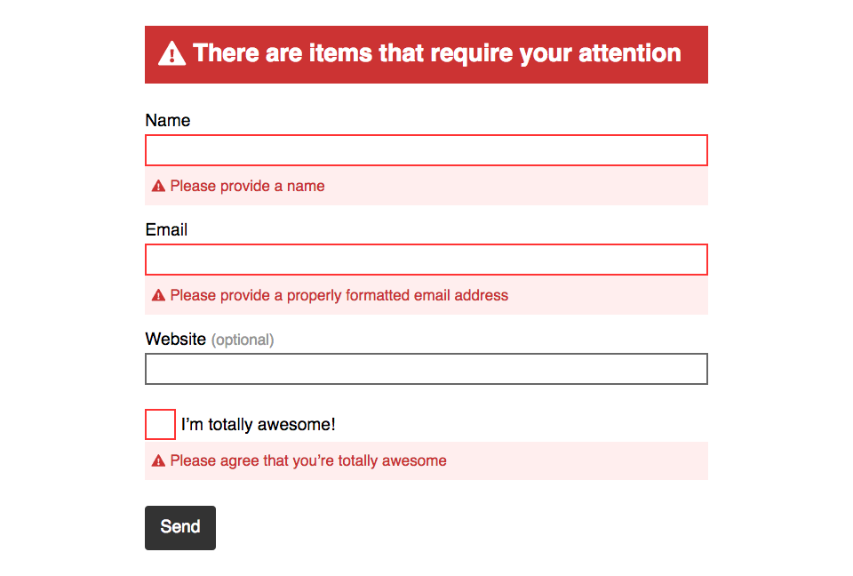
When we refresh the page or first come to the page, the error messages are already visible. Showing the error messages right away isn’t good for usability.

So: JavaScript to the rescue. With a little JS we can hide the error messages by default, then when the user submits the form we can display the error messages at that point.

Don’t worry though, the JS is pre-written and ready to run.

First we need to add a new attribute to the <form> tag: the novalidate attribute. It tells the browser not to run it’s default validation and allows our JavaScript to control the validation instead.

⋮
</head>
<body>

  <form class="max-length island" method="post" action="#" novalidate>
⋮

Then down at the bottom of the code we add the actual <script> tag to the JS file.

⋮
      <button class="btn" type="submit">Send</button>
    </div>
  </form>

  <script src="https://thomasjbradley.github.io/form-validation-helper/index.js"></script>
</body>
</html>

Here’s the JavaScript URL for quick copying-and-pasting:

https://thomasjbradley.github.io/form-validation-helper/index.js
  1. index.html — Line E

    Notice the new novalidate attribute on the form. This will tell the browser to not automatically validate the form on submission and allow our Javacript to do it instead.

  2. index.html — Line F

    Add the script tags immediately above the closing </body> tag—always.

    This script is a simple piece of JavaScript that will help with the usability of our forms. Combined with a few CSS tweaks it’ll hide the error messages until after the user tries to submit the form.

8 Fix the error messages

With the JavaScript in place we now need to tweak our CSS a little to better support what the JS is doing.

The JavaScript code will add the class .is-validated to our <form> tag when the user submits the form—but only if there are errors that should be shown.

It’s up to our CSS to show the right errors to the user with the right selectors.

⋮
.flag-optional {
  color: #999;
}

.is-validated input:invalid,
.is-validated input[type="checkbox"]:invalid + label::before,
.is-validated:invalid,
.is-validated[type="checkbox"]:invalid + label::before {
  border-color: #f33;
}

.error-message {
  display: none;
  background-color: #fee;
  color: #c33;
}

.error-message-highlighted {
  background-color: #c33;
  color: #fff;
}

.is-validated > .error-message:first-child,
.is-validated input:invalid + .error-message,
.is-validated input:invalid + label + .error-message,
.is-validated:invalid + .error-message,
.is-validated:invalid + label + .error-message {
  display: block;
}

When we load the page we should see the form like this:

And after we send the information we should see the error messages pop up:

  1. Lines F–G

    Prepend each of the selectors with .is-validated. This is what the JavaScript does: it adds the class to our <form> tag after the user tries to submit the form information.

  2. Lines H–I

    Add a few more selectors to handle different form field situations, and different ways of writing forms.

  3. Lines X–Z

    Also prepend each of these selectors with the .is-validated class.

  4. Lines AA–AB

    And some more different scenarios—gotta cover all possible situations!

Drop it into Markbot & submit

Drop the final, coded exercise into Markbot and fix all the errors until Markbot gives you all green (and maybe a little yellow).

After you’ve fixed all the problems, go ahead and submit the assignment. You’ll immediately get your grade.

  1. Submit

    Whenever you’ve passed all Markbot’s specific tests go ahead and submit this lesson for marks.