Different crops, same image

Use the picture tag to create a responsive banner that adjusts the image to fit the screen while maintaining the design aesthetic better.

Goal

We’re going to implement a different kind of responsive banner. Instead of have the text off the image on small screens, then on at larger screens, we’re going to make use of the <picture> tag to use the same general layout, but with differently cropped images.

This is what it should look like when it’s done:

  1. Type it, type it real good

    Remember the purpose of this lesson is to type the code out yourself—build up that muscle memory in your fingers!

Fork & clone

Start the lesson by forking and cloning the different-crops-same-image repository.

Fork & clone the “different-crops-same-image” repo.

The repository will have some starter files to get you on your way and include requirements for Markbot so you can be sure you’ve completed the lesson.

  1. Fork, clone & Markbot

    This includes some starter code that you can get by forking and cloning the repository. You’ll use Markbot to double check everything is done properly.

1 Download & set up files

After forking & cloning the repository, also download these PSD files for our images.

Download these files.

Following our standard folder layout we should have this:

  1. different-crops-same-image
  2. assets
  3. prod These are the files you downloaded
  4. banner.psd
  5. banner-l.psd
  6. banner-m.psd
  7. banner-s.psd
  8. different-crops-same-image The cloned GitHub repo
  9. css
  10. main.css
  11. modules.css
  12. type.css
  13. index.html

All the CSS has already been written. And some of the HTML has been written: mainly the boilerplate and the CSS connections.

Notice that I’ve already created all the different sizes of banner graphics. They have different aspect ratios and different croppings to optimize their indented screen size.

  1. Naming conventions

    Don’t forget to follow the naming conventions.

2 Save web-ready graphics

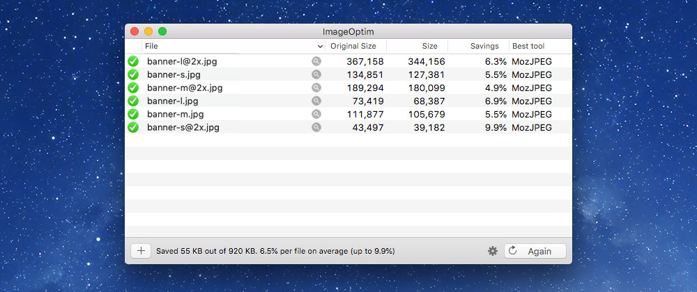
Before we get started writing the HTML, let’s export all the banner graphics from Photoshop using the “Save for web” utility.

**All the graphics are saved in their retina (2×) size. So we’ll need to resample them on save.

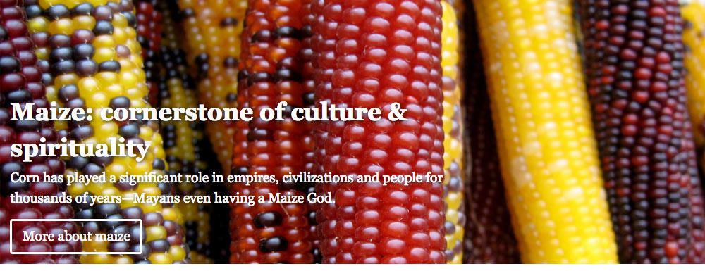
Large sizes: Open banner-l.psd

  1. Use “Save for web” to save it as a JPG—around 55% quality looks okay.
  2. Name it banner-l@2x.jpg in your images folder.
  3. Now, “Save for web” again, and resize it down to 1200 pixels wide (in the bottom right corner of the dialog).
  4. Save it as banner-l.jpg, around 55% is okay.

Medium sizes: Open banner-m.psd

  1. Same thing: save as JPG at its original size: banner-m@2x.jpg
  2. Resize to half size, 600px, and save another JPG: banner-m.jpg

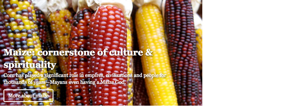
Small sizes: Open banner-s.psd

  1. Same thing: save as JPG at its original size: banner-s@2x.jpg
  2. Resize to half size, 320px, and save another JPG: banner-s.jpg
  1. different-crops-same-image
  2. assets
  3. prod
  4. different-crops-same-image
  5. css
  6. index.html
  7. images
  8. banner-l@2x.jpg
  9. banner-l.jpg
  10. banner-m@2x.jpg
  11. banner-m.jpg
  12. banner-s@2x.jpg
  13. banner-s.jpg

3 Smush ’em real good

Don’t forget to smush these JPGs! Drop them all into ImageOptim to get them as small as they can be.

4 Write small screen HTML

Now we’re ready to write the basic HTML for small screens. After that’s done we’ll add in the <picture> element to make responsive adaptations.

⋮
<body>

  <div class="banner relative">
    <img class="img-flex" src="images/banner-s.jpg" alt="">
    <div class="absolute pin-lb island-1-2 max-length">
      <h1 class="push-1-8">Maize: cornerstone of culture &amp; spirituality</h1>
      <p class="push-1-2">Corn has played a significant role in empires, civilizations and people for thousands of years—Mayans even having a Maize God.</p>
      <a class="btn btn-ghost banner-btn" href="#">More about maize</a>
    </div>
  </div>

</body>
⋮

We don’t need to write any CSS, I’ve already done CSS for .banner & .banner-btn so we can concentrate on the HTML.

Pop that open in your browser and see what it looks like.

  1. Line E

    We’re starting with the super basic image tag, just a single <img> that points to the banner-s.jpg

5 Add picture element for different sizes

Now we’ll update the HTML to add a <picture> element that will allow the image to change depending on the screen size.

⋮
<div class="banner relative">
  <picture class="img-flex">
    <source media="(min-width:60em)" srcset="images/banner-l.jpg">
    <source media="(min-width:38em)" srcset="images/banner-m.jpg">
    <img src="images/banner-s.jpg" alt="">
  </picture>
  <div class="absolute pin-lb island-1-2 max-length">
    <h1 class="push-1-8">Maize: cornerstone of culture &amp; spirituality</h1>
    <p class="push-1-2">Corn has played a significant role in empires, civilizations and people for thousands of years—Mayans even having a Maize God.</p>
    <a class="btn btn-ghost banner-btn" href="#">More about maize</a>
  </div>
</div>
⋮

Now as we adjust the screen size you’ll see that the image changes to one of the alternatives. I think this is a much more direct & simple way to create a responsive banner than making a bunch of media queries. Plus we get the added benefit of the banner actually looking much more similar between different screen sizes.

Check it out in your browser. Make sure to change the screen size!

  1. Line C

    Add a new <picture> tag surrounding the old <img> tag. Notice that we moved the .img-flex class up to <picture> and removed it from <img>

  2. Line D

    We start with the largest size possible: when the screen is larger than 60em; link in the banner-l.jpg image.

  3. Line E

    The next size is the medium-sized image at 38em—our banner-m.jpg

  4. Line F

    We deleted the .img-flex from the <img> and moved it up to the <picture> tag instead.

6 Add the retina images

The final thing we’re going to do is modify the <picture> element further to add all our retina-ready graphics.

⋮
<div class="banner relative">
  <picture class="img-flex">
    <source media="(min-width:60em)" srcset="images/banner-l@2x.jpg 2x, images/banner-l.jpg 1x">
    <source media="(min-width:38em)" srcset="images/banner-m@2x.jpg 2x, images/banner-m.jpg 1x">
    <img srcset="images/banner-s@2x.jpg 2x, images/banner-s.jpg 1x" src="images/banner-s.jpg" alt="">
  </picture>
  <div class="absolute pin-lb island-1-2 max-length">
    <h1 class="push-1-8">Maize: cornerstone of culture &amp; spirituality</h1>
    <p class="push-1-2">Corn has played a significant role in empires, civilizations and people for thousands of years—Mayans even having a Maize God.</p>
    <a class="btn btn-ghost banner-btn" href="#">More about maize</a>
  </div>
</div>
⋮

It’s a little harder to see these changes because the images look identical on retina and non-retina screens.

If you want to truly see it working, the only way I know how, is to use the browser’s developer tools and look in the “Network” panel. As you resize the screen and move the browser between retina & non-retina screens you’ll see the different versions download.

  1. Line D

    I added images/banner-l@2x.jpg 2x to the start of the srcset

    Also notice the addition of the 1x at the very end of the srcset

    No we’re specifying that on large screens there’s a retina-friendly graphic & a low-density graphic.

  2. Line E

    Same deal for the second <source> tag—retina and non-retina versions for medium.

  3. Line F

    Finally, I added a whole new attribute to the <img> tag: the srcset attribute. Like the two <source> tags it shows two different resolutions of images.

    The srcset attribute in <img> tags is not a replacement for the basic src

Drop it into Markbot & submit

Drop the final, coded exercise into Markbot and fix all the errors until Markbot gives you all green (and maybe a little yellow).

After you’ve fixed all the problems, go ahead and submit the assignment. You’ll immediately get your grade.

  1. Submit

    Whenever you’ve passed all Markbot’s specific tests go ahead and submit this lesson for marks.