Now, let’s add a few classes to adjust the font size on some elements, to make them bigger and smaller.
Typografier’s font-size classes are based on the metric system, or computer sizes if that’s more familiar. .micro is the smallest, going up to .kilo, .giga, and all the way to .yotta
There are only 10 font-sizes to choose from—if you need more than that you’re probably doing something wrong.
⋮
<body>
<article class="card">
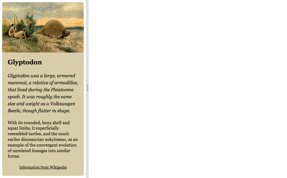
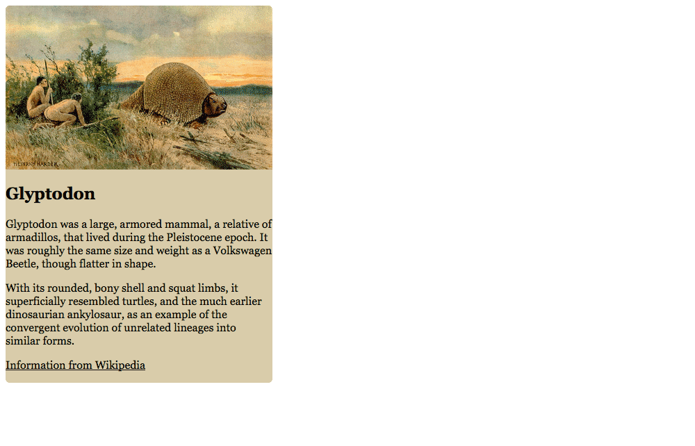
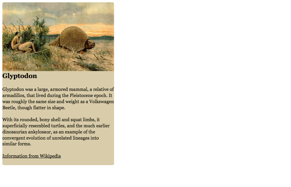
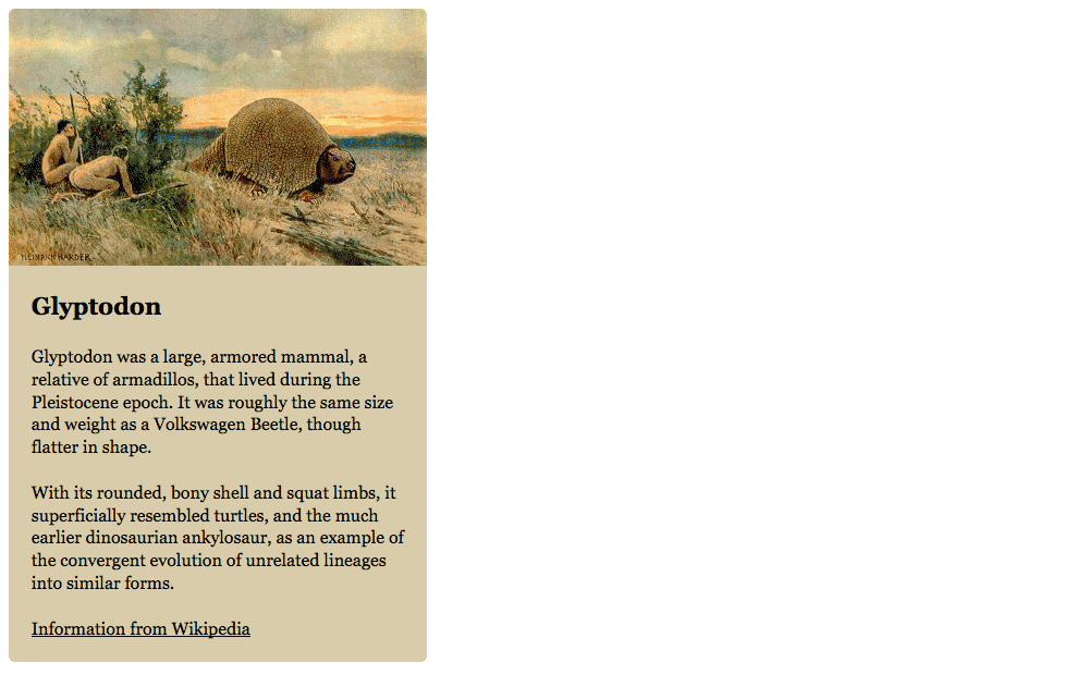
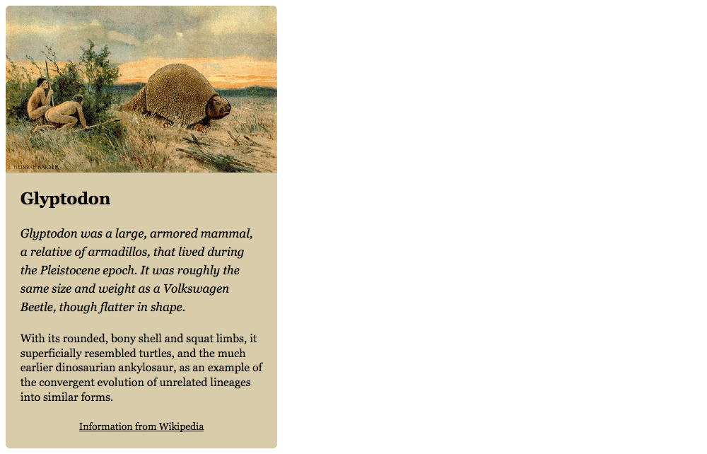
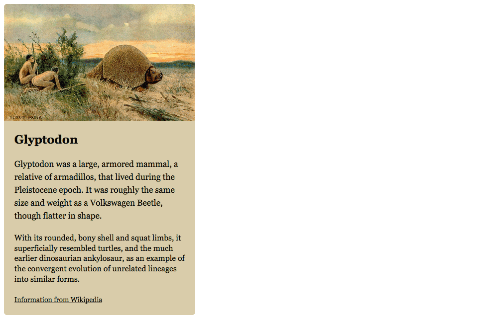
<img class="img-flex" src="images/glyptodon.jpg" alt="">
<div class="island">
<h1 class="zetta">Glyptodon</h1>
<p class="mega">Glyptodon was a large, armored mammal, a relative of armadillos, that lived during the Pleistocene epoch. It was roughly the same size and weight as a Volkswagen Beetle, though flatter in shape.</p>
<p>With its rounded, bony shell and squat limbs, it superficially resembled turtles, and the much earlier dinosaurian ankylosaur, as an example of the convergent evolution of unrelated lineages into similar forms.</p>
<footer class="micro">
<p class="push-0"><a href="https://en.wikipedia.org/wiki/Glyptodon">Information from Wikipedia</a></p>
</footer>
</div>
</article>
</body>
</html>
Refresh to see the layout now. Make sure to resize your browser to see how the font sizes change.