We’re going to look at how to make the image card pattern, concentrating on position absolute and relative.
This is what it should look like when it’s done:

Use media queries and knowledge of how display works to create a responsive navigation.
We’re going to look at how to make the image card pattern, concentrating on position absolute and relative.
This is what it should look like when it’s done:
Remember the purpose of this lesson is to type the code out yourself—build up that muscle memory in your fingers!
Start the lesson by forking and cloning the responsive-navigation repository.
Fork & clone the “responsive-navigation” repo.
The repository will have some starter files to get you on your way and include requirements for Markbot so you can be sure you’ve completed the lesson.
This includes some starter code that you can get by forking and cloning the repository. You’ll use Markbot to double check everything is done properly.
After forking & cloning, before writing some code, create some files and get ready.
index.htmlmain.css in your css folder.Don’t forget to follow the naming conventions.
Use the html5, viewport and css snippets.
<!DOCTYPE html>
<html lang="en-ca">
<head>
  <meta charset="utf-8">
  <title>Responsive navigation</title>
  <meta name="viewport" content="width=device-width,initial-scale=1">
  <link href="css/main.css" rel="stylesheet">
</head>
<body>

</body>
</html>
Create the boilerplate with html5, viewport & css
The viewport tag is extremely critical for responsive websites—it tells mobile browsers a couple things:
Don’t forget to attach the CSS file.
Our CSS now needs a little more default code to better support all the browsers that exist. Making sure we tell the browsers that our website is properly set up for the device.
Use the cssviewport, borderbox & textsize snippets.
@-moz-viewport { width: device-width; scale: 1; }
@-ms-viewport { width: device-width; scale: 1; }
@-o-viewport { width: device-width; scale: 1; }
@-webkit-viewport { width: device-width; scale: 1; }
@viewport { width: device-width; scale: 1; }

html {
  -moz-text-size-adjust: 100%;
  -ms-text-size-adjust: 100%;
  -webkit-text-size-adjust: 100%;
  text-size-adjust: 100%;
  box-sizing: border-box;
  font: normal 100%/1.3 sans-serif;
}

*, *::before, *::after {
  box-sizing: inherit;
}

body {
  margin: 0;
}
Create the boilerplate with cssviewport, borderbox & textsize
The CSS @viewport lines have the same functionality as the viewport tag in HTML, they just serve different browsers.
Eventually the CSS @viewport will replace the HTML version.
The -moz-, -ms-, -o- & -webkit- parts are called vendor prefixes. They are beta versions of the feature that target specific browsers.
-moz- — Mozilla, aka Firefox-ms- — Microsoft: IE & Edge-o- — Opera, older versions-webkit- — Webkit: Safari, Chrome, newer OperaThe text-size-adjust property tells the browser not to scale the fonts because we’ve set them up properly to be readable on any device screen.
Set up a good font for small screens:
font-size of 100%line-height of 1.3Let’s add the standard HTML we need to making navigation in a website.
Even though this website will be responsive the HTML is exactly the same as we’ve written many times before.
⋮
</head>
<body>

  <header>
    <h1>Quetzalcoatlus</h1>
    <nav>
      <ul>
        <li><a href="#">Environment</a></li>
        <li><a href="#">Dimensions</a></li>
        <li><a href="#">Diet</a></li>
        <li><a href="#">Flight</a></li>
      </ul>
    </nav>
  </header>

</body>
</html>
⋮
We always—always—style the small screen version of our website first—this does not require media queries.
If we start with larger screen we end up making significantly more work for ourselves and we require so much extra, unnecessary CSS.
⋮
body {
  margin: 0;
}

header {
  padding: .5rem 0;
  background-color: #ccc;
  text-align: center;
}

h1 {
  margin: 0 0 .5rem;
  font-size: 1.5rem;
}

nav ul {
  margin: 0;
  padding: 0;
  list-style-type: none;
}

nav li {
  text-align: left;
}

nav a {
  display: block;
  padding: .5em .75em;
  color: #333;
  text-decoration: none;
}

nav a:hover {
  background-color: #333;
  color: #fff;
}
There’s nothing special in this CSS—it’s exactly the same CSS we’ve written many times before.
With a refresh in our browser this is what we should see. Make sure to open the developer tools and set the browser width to 320px.
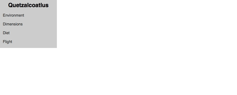
The small screen CSS is the most critical part of the CSS—it works on the most devices.
The small screen CSS always goes at the top of our file because it influences all other screen sizes.
Next we slowly increase the width of our browser window until the content looks awkward or could be improved.
At around 400px—25em—the navigation can fit all across one line instead of being stacked—this is a good point to add a media query.
⋮
nav a:hover {
  background-color: #333;
  color: #fff;
}

@media only screen and (min-width: 25em) {

  nav li {
    display: inline-block;
    text-align: center;
  }

}
Adjust the browser’s width over 400 pixels to see the navigation change:
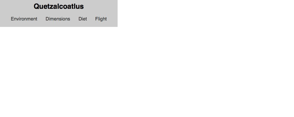
Here’s our media query—we do not repeat any of the above CSS in the media query because it adds onto what’s already there.
At the 25em breakpoint the only differences are that the <li> tags are side-by-side and centred—so no other CSS is written.
The media queries build on top of everything before them.
As the screen sizes get bigger we want to make small adjustments to the typography so it looks better and fits better on the screen.
The defaults for small and extra small screens are 100%/1.3—which is great on tiny screens but too small and too tight on larger screens.
So we incrementally enlarge the sizes as the screens get bigger.
⋮
    text-align: center;
  }

}

@media only screen and (min-width: 38em) {

  html {
    font-size: 110%;
    line-height: 1.4;
  }

}

@media only screen and (min-width: 60em) {

  html {
    font-size: 120%;
    line-height: 1.5;
  }

}

@media only screen and (min-width: 90em) {

  html {
    font-size: 130%;
  }

}
Play with the width of the browser window to see the font-size increase as the browser gets wider:
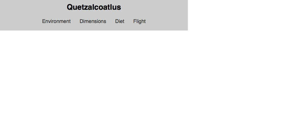
We target the <html> element to adjust the font-size because rem is based on it—so all the rem font-sizes we’ve specified naturally increase.
Medium screens—38em get these settings:
font-size of 110%line-height of 1.4Large screens—60em get these settings:
font-size of 120%line-height of 1.5Extra large screens—90em get these settings:
font-size of 130%line-height because it will just be inherited from the 60em media query.As the browser window gets wider we should capitalize on the fact that we now have more horizontal space by putting the logo and the navigation on the same line.
@media only screen and (min-width: 60em) {
  ⋮
  html {
    font-size: 120%;
    line-height: 1.5;
  }

  header {
    padding-left: 1rem;
    padding-right: 1rem;
    text-align: left;
  }

  h1,
  nav {
    display: inline-block;
    vertical-align: middle;
  }

  h1 {
    margin-bottom: 0;
    margin-right: 1.5rem;
  }

}
⋮
Now our header uses the space more effectively on larger screens:
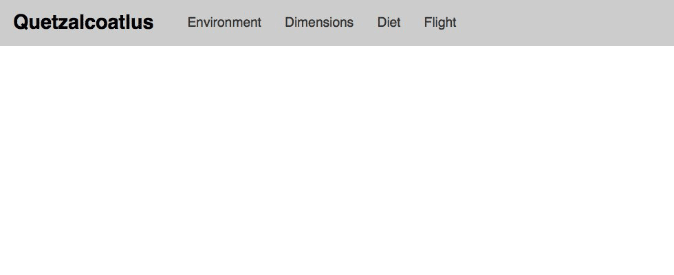
Change both the <h1> and the <nav> tag to inline-block so they sit beside each other on the same line.
We need to remove the bottom margin from the <h1> because we added a margin further up in the CSS.
All the CSS above this media query is still in effect—our media query is just adding on top of what’s already there.
The media queries are always building on top of what’s above them.
Therefore the order that you put them in is important—smallest at the top & larger sizes as you go down the stylesheet.
There are standard sizes that I almost always use see the screen size cheat sheet for the defaults.
But remember these are not the only sizes that you can use—use any size that makes sense for your design.
Drop the final, coded exercise into Markbot and fix all the errors until Markbot gives you all green (and maybe a little yellow).
After you’ve fixed all the problems, go ahead and submit the assignment. You’ll immediately get your grade.