We’re going to look at how to make the image card pattern, concentrating on position absolute and relative.
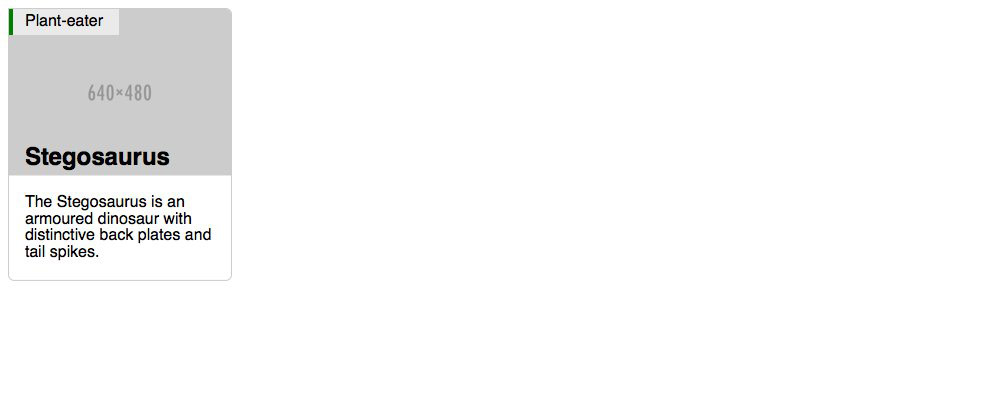
This is what it should look like when it’s done:
Use CSS position absolute and relative to make an image card.
We’re going to look at how to make the image card pattern, concentrating on position absolute and relative.
This is what it should look like when it’s done:
The two important bits are the “Plant-eater” label and the “Stegosaurus” heading and how they’re on top of the image.
Remember the purpose of this lesson is to type the code out yourself—build up that muscle memory in your fingers!
Start the lesson by forking and cloning the making-an-image-card repository.
Fork & clone the “making-an-image-card” repo.
The repository will have some starter files to get you on your way and include requirements for Markbot so you can be sure you’ve completed the lesson.
This includes some starter code that you can get by forking and cloning the repository. You’ll use Markbot to double check everything is done properly.
Before we get started, create some files and get ready.
index.htmlmain.css in your css folder.Don’t forget to follow the naming conventions.
Use the html5, viewport and css snippets.
<!DOCTYPE html>
<html lang="en-ca">
<head>
  <meta charset="utf-8">
  <title>Image card</title>
  <meta name="viewport" content="width=device-width,initial-scale=1">
  <link href="css/main.css" rel="stylesheet">
</head>
<body>

</body>
</html>
Create the boilerplate with html5, viewport & css
Don’t forget to attach the CSS file.
Use the borderbox snippet.
html {
  box-sizing: border-box;
  font-family: sans-serif;
}

*, *::before, *::after {
  box-sizing: inherit;
}

.img-flex {
  display: block;
  width: 100%;
}
Make a class to use on any image to make it scalable.
Let’s start with a little HTML before moving into the CSS guts.
⋮
</head>
<body>

  <article class="card">
    <header class="card-head">
      <h2 class="card-title">Stegosaurus</h2>
      <span class="card-label">Plant-eater</span>
      <img class="img-flex" src="https://placehold.it/640x480" alt="">
    </header>
    <div class="card-body">
      <p>The Stegosaurus is an armoured dinosaur with distinctive back plates and tail spikes.</p>
    </div>
  </article>

</body>
</html>
There’re classes on just about everything to distinguish them from other elements in our page.
Semantically an <article> makes sense because this can stand by itself.
The important bits are in the <header> because a group will be needed for CSS later.
Don’t forget the img-flex class to make the image flexible.
Before we get into the positioning stuff, let’s get the basic card look done.
⋮
  display: block;
  width: 100%;
}

.card {
  overflow: hidden;
  border: 1px solid #ccc;
  border-radius: 0 6px 6px;
}

.card-body {
  padding: .2rem 1rem;
}

.card-title {
  margin: 0;
  padding: .3rem 1rem;
}

.card-label {
  padding: .3rem 1rem .3rem calc(1rem - 4px);
  border-left: 4px solid green;
  background-color: rgba(255, 255, 255, .6);
}
With a refresh what you should see is this:
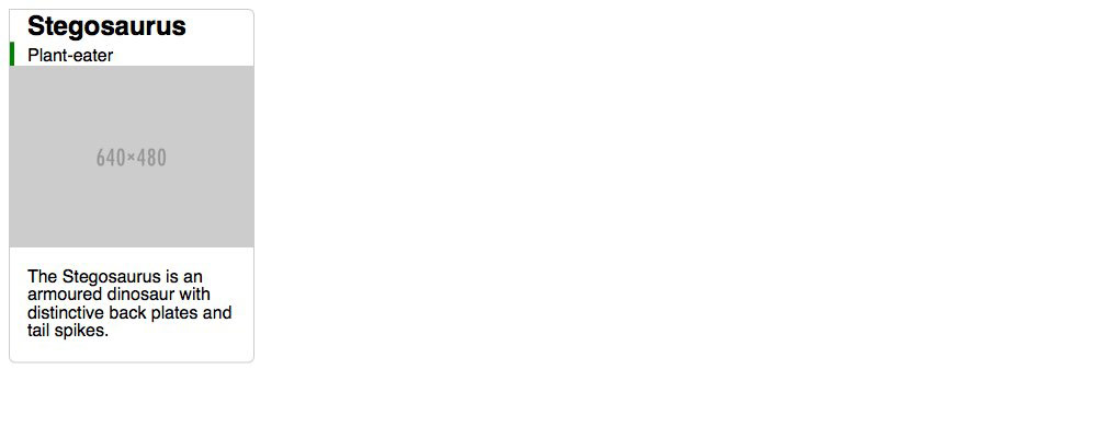
Make sure to shrink the width of your browser—the image card is completely flexible.
The overflow: hidden is here to chop the corners of the image off.
The crazy calc() is just really to make the text align properly when it also has a border.
The calc() value allows us to get the browser to calculate between two different units.
Now let’s position the .card-title so that it sits at the bottom of the image.
.card-title {
  ⋮
  margin: 0;
  padding: .3rem 1rem;
  position: absolute;
  bottom: 0;
  left: 0;
  width: 100%;
}
Notice how the title is now at the bottom of the screen, that’s because the coordinates for absolute default to position against <body>
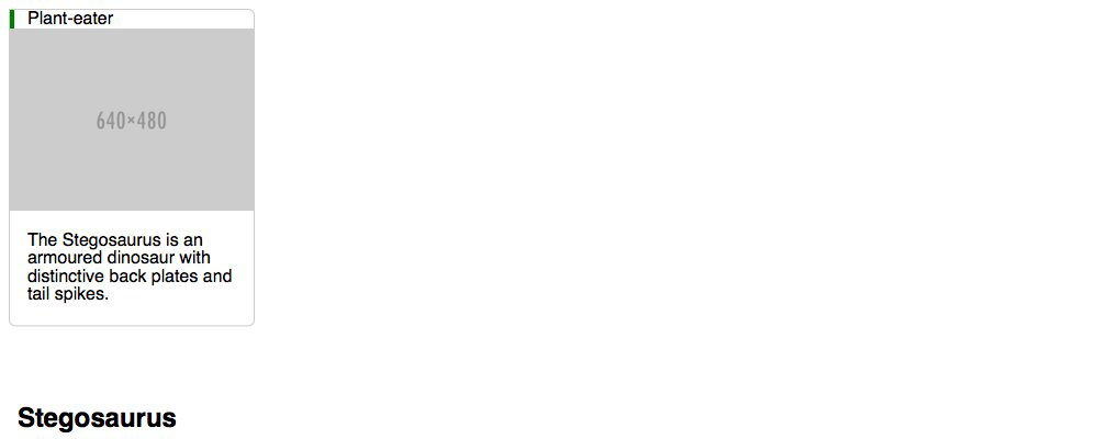
Make sure to shrink the width of your browser—the image card is completely flexible.
Setting it to position: absolute allows us to move it around using coordinates.
Using left and bottom to move it to the bottom of the image.
The width is there because absolute elements shrink to be as small as possible.
To fix the positioning of the .card-title we need to find a parent element that we can set position: relative
Using relative will reset the coordinates so the bottom and left position against the parent container instead.
Luckily, it’s inside the <header class="card-head"> tag. So let’s target that!
⋮
  border-left: 4px solid green;
  background-color: rgba(255, 255, 255, .6);
}

.card-head {
  position: relative;
}
Now the .card-title snaps right into place.
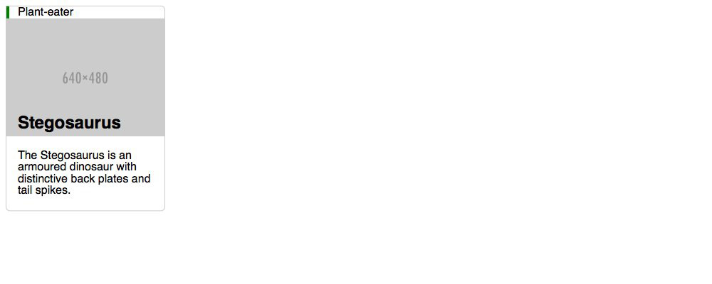
Using position: relative on this element will reset the coordinate system for all absolute children.
Since the .card-head is already relative all we need to do is just put absolute and coordinates onto .card-label
Because it’s parent container is relative it will automatically position itself against that box.
.card-label {
  ⋮
  padding: .3rem 1rem .3rem calc(1rem - 4px);
  border-left: 4px solid green;
  background-color: rgba(255, 255, 255, .6);
  position: absolute;
  left: 0;
  top: 0;
}
Drop the final, coded exercise into Markbot and fix all the errors until Markbot gives you all green (and maybe a little yellow).
After you’ve fixed all the problems, go ahead and submit the assignment. You’ll immediately get your grade.