A quick introduction to the CSS float & clear properties, how they work and what they do.

Go fullscreen: ⌃⌥F

Float & clear

Side-by-side

  • Use float to get things beside other things
  • Or to have text wrap around something

Like inline-block but more precise

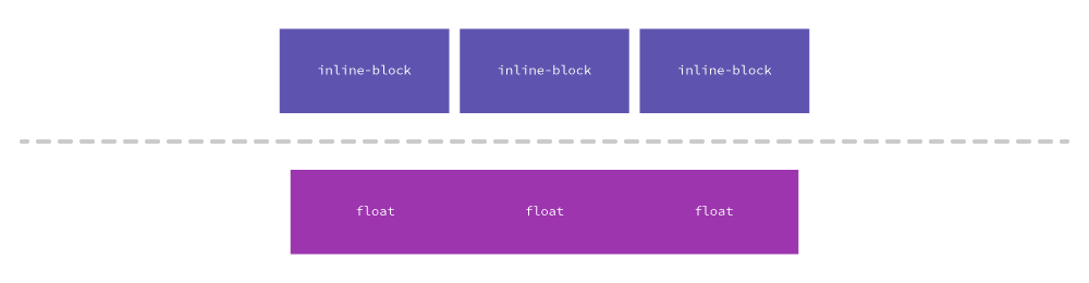
Inline-block will always have a little space between—where floated boxes can touch.

Float

  • left
  • right
  • none — helpful later for responsive sites

Almost always add width

.column {
  float: left;
  width: 25%;
}
HTML
<div class="columns">
  <div class="col">Column 1</div>
  <div class="col">Column 2</div>
</div>
CSS
.col {
  float: left;
  width: 50%;
  background-color: yellow;
}
HTML
<div class="columns">
  <div class="col">Column 1</div>
  <div class="col">Column 2</div>
</div>
CSS
.columns {
  border: 3px solid red;
}
.col {
  float: left;
  width: 50%;
  background-color: yellow;
}
HTML
<div class="columns">
  <div class="col">Column 1</div>
  <div class="col">Column 2</div>
</div>
CSS
.columns {
  border: 3px solid red;
  overflow: hidden; /* Simple clearfix */
}
HTML
<div class="columns clearfix">
  <div class="col">Column 1</div>
  <div class="col">Column 2</div>
</div>
CSS
/* Alternative clearfix */
.clearfix::after {
  content: " ";
  display: block;
  clear: both;
}

Clearing

You almost always have to clearfix the parent of floated elements.

  1. overflow: hidden — Can clearfix parents, but also crops

  2. .clearfix {…} — More reliable, more code

Start

A quick introduction to the CSS float & clear properties, how they work and what they do.