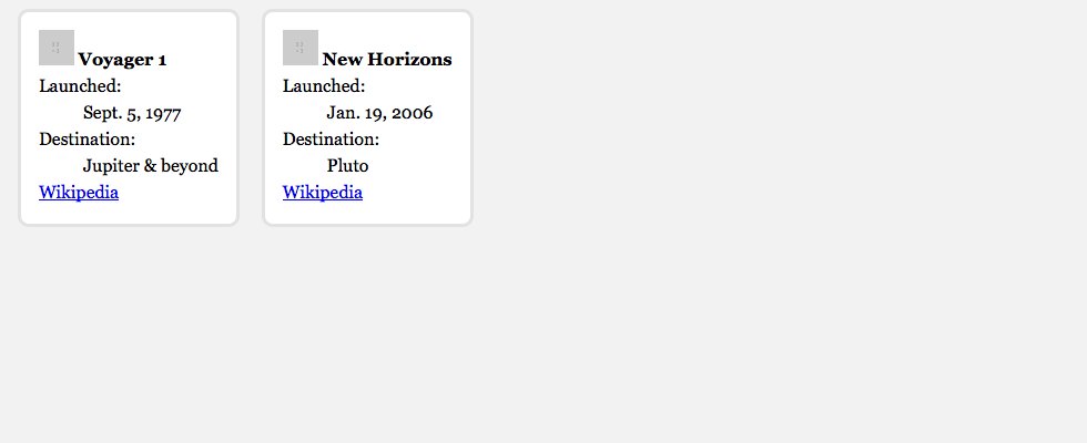
We’re going to walk through writing some HTML and CSS to generate an informational layout.
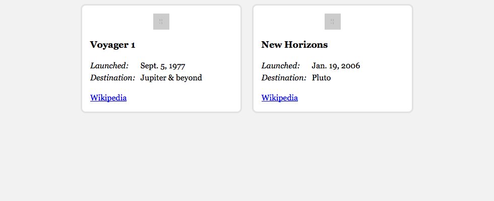
This is what it should look like when it’s done:
Dig into the browser’s layout models to make a simple, flexible informational design.
We’re going to walk through writing some HTML and CSS to generate an informational layout.
This is what it should look like when it’s done:
Remember the purpose of this lesson is to type the code out yourself—build up that muscle memory in your fingers!
Start the lesson by forking and cloning the cards repository.
Fork & clone the “cards” repo.
The repository will have some starter files to get you on your way and include requirements for Markbot so you can be sure you’ve completed the lesson.
This includes some starter code that you can get by forking and cloning the repository. You’ll use Markbot to double check everything is done properly.
After cloning the repo to your computer we need to create the default files.
index.html file in your cards folder.css in your cards folder.main.css in your css folder.Don’t forget to follow the naming conventions.
Use the html5, viewport and css snippets.
<!DOCTYPE html>
<html lang="en-ca">
<head>
  <meta charset="utf-8">
  <title>Cards</title>
  <meta name="viewport" content="width=device-width,initial-scale=1">
  <link href="css/main.css" rel="stylesheet">
</head>
<body>

</body>
</html>
Create the boilerplate with html5, viewport & css
Don’t forget to attach the CSS file.
Use the borderbox snippet.
html {
  box-sizing: border-box;
}

*, *::before, *::after {
  box-sizing: inherit;
}
The border-box system changes the browsers layout math to include the padding in the width—the default is more difficult to manage when making flexible, responsive websites.
Create the boilerplate with borderbox
For the cards, an unordered list makes sense because the website is a list of space probes.
⋮
  <link href="css/main.css" rel="stylesheet">
</head>
<body>

  <ul class="cards">

    <li>
      <img src="https://placehold.it/32x32" alt="">
      <strong>Voyager 1</strong>
      <dl>
        <dt>Launched:</dt>
        <dd><time datetime="1977-09-05">Sept. 5, 1977</time></dd>
        <dt>Destination:</dt>
        <dd>Jupiter & beyond</dd>
      </dl>
      <div>
        <a href="https://en.wikipedia.org/wiki/Voyager_1">Wikipedia</a>
      </div>
    </li>

    <!-- Copy and paste the above <li> here to make the second card -->

  </ul>

</body>
</html>
Copy the <li> tag you wrote above and paste it in the place of the comment. Change its details to reflect the “New Horizons” probe.
This is what you should see in your browser:
Add a class to the <ul> so we can style it directly.
We’re using an image placeholder service to make an image for us—that way we don’t have to go into Photoshop to create a new image.
The 32x32 part is the pixel dimensions of the image we want. You can see more options on the PlaceHold.it website.
The <strong> tag makes semantic sense because the name of the probe is more important than the surrounding text.
There’s a semantically meaningless <div> tag here that we’re going to use as a CSS styling hook later.
Let’s add some basic CSS style to make the website look a little nicer.
html {
  box-sizing: border-box;
  background-color: #f2f2f2;
  font-family: Georgia, serif;
  line-height: 1.5;
}

*, *::before, *::after {
  box-sizing: inherit;
}
This is what you should see in your browser:
Adjust the background-color, font-family and line-height to make it look a little more pleasant.
Next up we’ll style the card itself by adding some colours, borders, and sizes.
⋮
*, *::before, *::after {
  box-sizing: inherit;
}

.cards {
  margin: 0;
  padding: 0;
  list-style-type: none;
}

.cards li {
  display: inline-block;
  margin: 0 .5em 1em;
  max-width: 20em;
  padding: 1em;
  background-color: #fff;
  border: 3px solid #e2e2e2;
  border-radius: 10px;
}
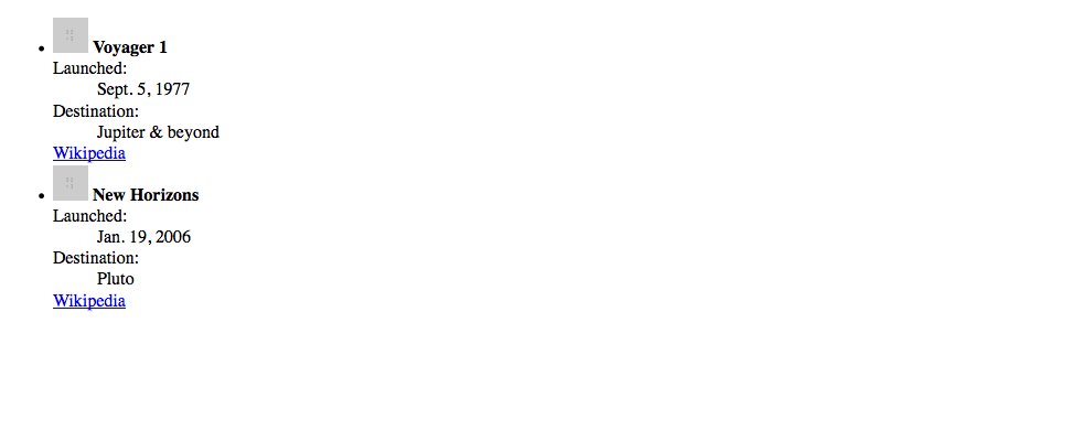
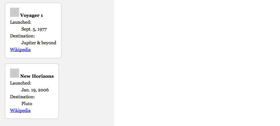
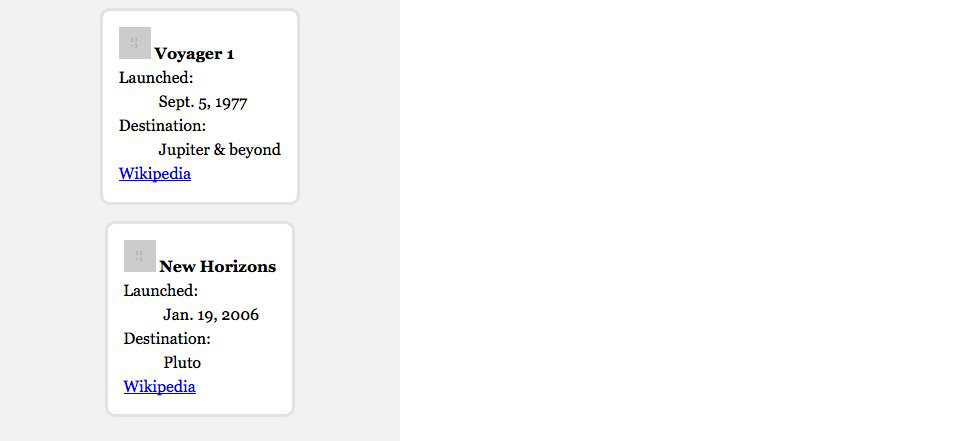
This is what you should see in your browser when the window’s width is small:
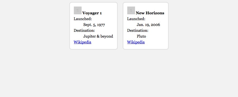
And when the width is a little wider:
Notice how we’re taking advantage of the browser’s flow:
This is because we’re using display: inline-block on the <li> tags.
By using the developer tools I know that the <ul> has margin, padding, and list-style-type on it by default—this code will reset the defaults provided by the browser.
Use a child selector to get the <li> tags inside of .cards
The <li> tags are display: block by default, which makes them go on their own lines. This code will change them to inline-block allowing them to sit beside each other.
The margin property adds space outside of the box.
This margin is composed of four values:
Start at the top and work clockwise around the box.
Using max-width allows the boxes can scale up to only a certain size.
The padding property will add spacing inside the box.
Padding can have four values like margin or only one value that will affect all four sides. (Margin does this too.)
The border property allows us to add a stroke around the outside of a box.
Borders require three pieces of information:
solid, dotted, dashed, etc.The border-radius property allows us to round the corners of a box.
It would look a little better if the boxes were centred on the screen instead of flush-left.
⋮
*, *::before, *::after {
  box-sizing: inherit;
}

.cards {
  ⋮
  padding: 0;
  list-style-type: none;
  text-align: center;
}

.cards li {
  ⋮
  border: 3px solid #e2e2e2;
  border-radius: 10px;
  text-align: left;
}
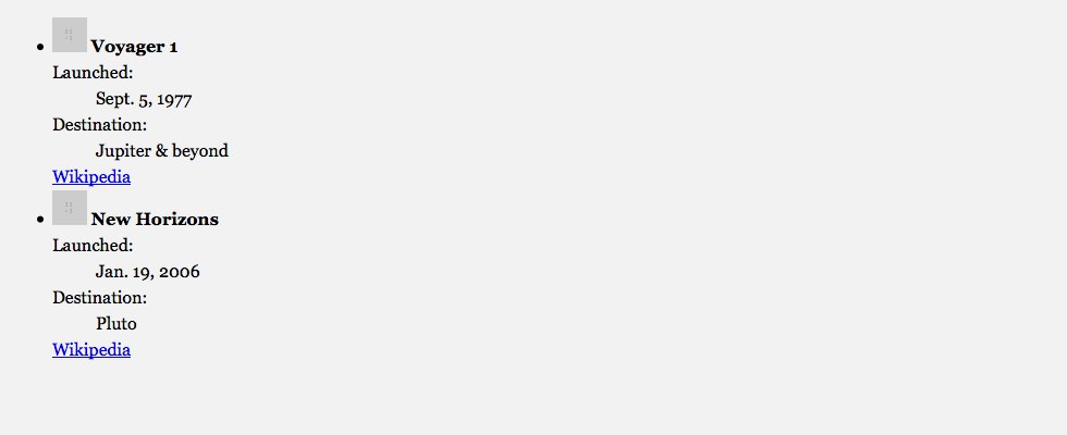
This is what you should see in your browser when the window’s width is small:
And when the width is a little wider:
Because the <li> tags are inline-block we can use text-align: center, which works on all inline and inline-block elements.
We need to put text-align: center on a parent element so that it affects all of its children.
Because we set everything inside .cards to be centred that would affect all the text too, but we only want to center the boxes not the text—so we have to reset the interior of the boxes to text-align: left
Let’s concentrate on the inside of the boxes by styling the small image and some of the text.
⋮
  border: 3px solid #e2e2e2;
  border-radius: 10px;
  text-align: left;
}

.cards img {
  display: block;
  margin: 0 auto 1rem;
}

.cards strong {
  display: block;
  margin-bottom: 1rem;

  font-size: 1.125rem;
}

.cards dl {
  margin-bottom: 1rem;
}
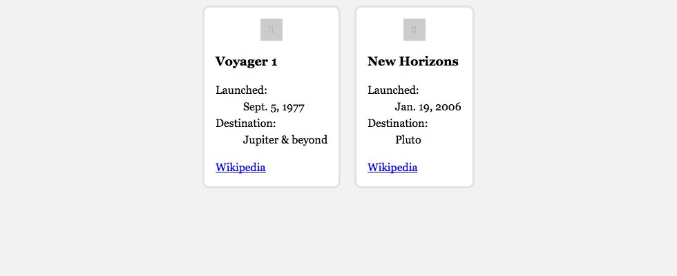
This is what you should see in your browser:
The display: block will put the image on its own line instead of beside the probe’s name.
The image will look better centred, but because the image is block text-align: center no longer works. Instead we can use automatic left and right margins.
Adding margin to a <strong> tag doesn’t work by default because <strong> tags are inline—margins only work on block and inline-block
Add a little space after the <dl> to push the “Wikipedia” link further down.
Using the display property and some widths we can style the <dl> so that the <dt> and <dd> tags are on the same line.
⋮
.cards dl {
  margin-bottom: 1rem;
}

.cards dt {
  display: inline-block;
  width: 6em;
  font-style: italic;
}

.cards dd {
  display: inline-block;
  margin: 0;
  min-width: 9em;
}
This is what you should see in your browser:
Setting both the <dt> and <dd> tags to display: inline-block (overwriting the browser’s default block) will allow them to be on the same line.
By adding a width to the <dt> tag we can get a nice alignment of all the <dd> tags.
The width is set in em units so that it can grow with the font size.
Adding a min-width to the <dd> tags will force the <dt> tag that follows onto its own line.
Using display and a few other box properties we can make the <a> tags look like full buttons.
⋮
  margin: 0;
  min-width: 9em;
}

.cards div {
  text-align: center;
}

.cards a {
  display: inline-block;
  padding: .5em .75em;
  background-color: #ccc;
  border-radius: 4px;
  color: #000;
  text-decoration: none;
}

.cards a:hover {
  background-color: #333;
  color: #fff;
}
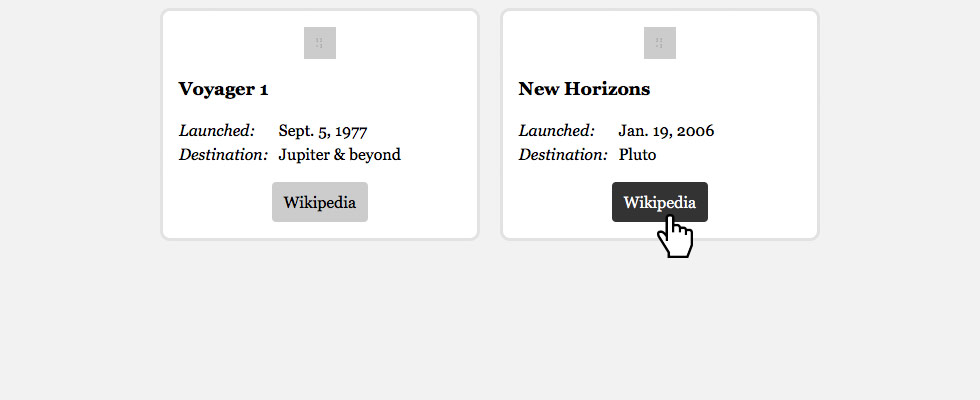
Test it in your browser to make sure it looks like the goal at the top.
Using the <div> that surrounds the <a> tag we can centre the link.
text-align: center directly on the link only the text inside it would be affected—because text-align only targets children.auto margins because that only works on display: block elements, and we don’t want the link to stretch all the way across.Adding display: inline-block to the <a> tag will allow us to add padding since padding doesn’t work well on inline elements.
It’s okay to remove the underline from links when they are distinctly separate from the body copy. In this case it’s okay because the link looks like a button.
Don’t forget to add a :hover state to the link.
Drop the final, coded exercise into Markbot and fix all the errors until Markbot gives you all green (and maybe a little yellow).
We don’t have an <h1> in this code because I feel like these cards are part of a larger website so the <h1> would probably be somewhere else on the page.
After you’ve fixed all the problems, go ahead and submit the assignment. You’ll immediately get your grade.